Magic Kingdom Purple Palace

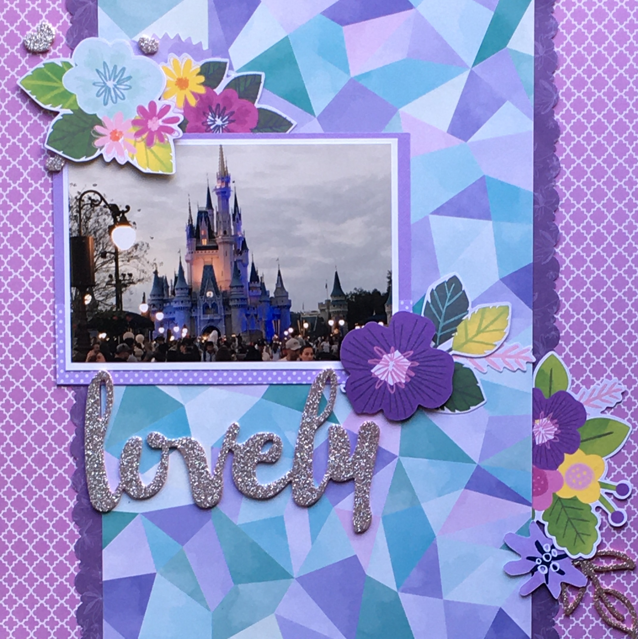
I seriously cannot believe how many photos from the Magic Kingdom have blue and purple as the predominant colors. Hey paper manufacturers, why are all of your Disney inspired collections red, light blue, and yellow? Could we maybe get some purple? Pretty please? When the castle is lit up at night, it’s in blue, pink, and purple tones. I would love to see a collection to match!

For this layout, I immediately gravitated towards that ombre purple background paper. That has to be one of my favorite papers of all time. I paired that with the darker purple paper that I purchased back in 2006 or 2007. I paid a whopping 10 cents for it on sale. That’s right. I’ve held onto a piece of paper for 15 years that cost me a dime. It was finally time for it to shine. I also used some cardstock in order to help the photo pop from the background.

I’ve mentioned before how limited I am when it comes to purple embellishments. For this layout, I decided to let the color of my shirt and the pinkish bit in the middle of the castle to help alleviate this issue. There are still a few bits of purple. The bluish purple piece with the “Hearts” tab was from a set of card blanks I purchased over a decade ago. This was a divider in that set. I knew I had held onto it for a reason. I also recently bought a die-cut pack that only has purple pieces. That’s where I got the “Be-You-Tiful” die. Lastly, I sprinkled a few tiny purple gems here and there.

I decided to also use some maroon, pink, and white for contrast. The maroon dies are from a fall themed pack. I love it when I can use embellishments in a different way than they were intended. I was thrilled to also use the black and white flowers. They’ve been in my stash for a couple of years, and I had no idea of how to use them. This seemed like a perfect opportunity. There was also a ton of joy in using up those itty bitty words and phrases to the right of the photo. They were exactly what I needed to help fill in that empty space. There is something incredibly satisfying about using up supplies that have flummoxed you for quite some time.

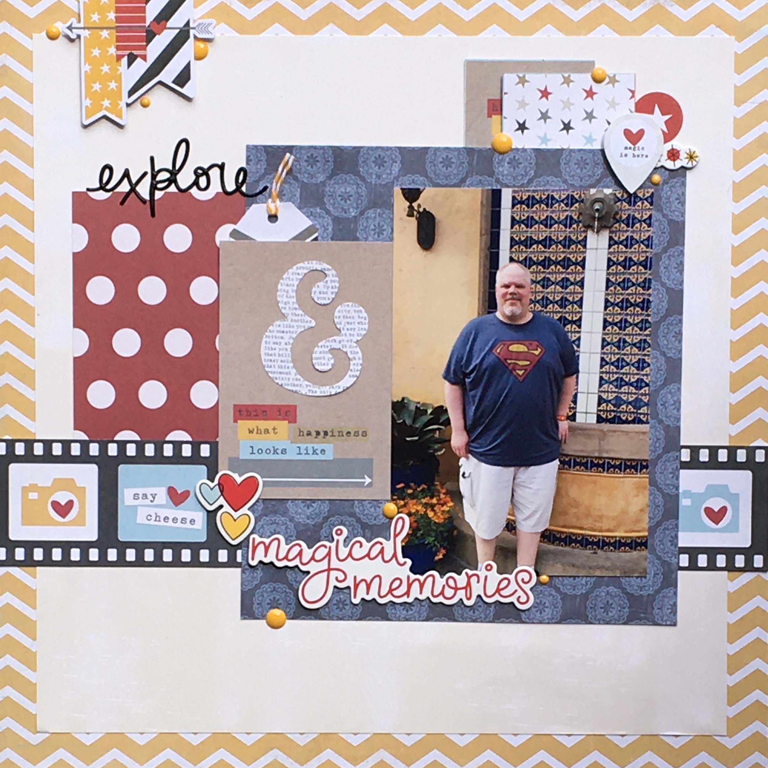
Disney tip: It’s not easy to get a photo without a million people in the background when you are at Disney. As Disney returns to normalcy, I would encourage people to consider buying the tickets for extended evenings. Yes, it is ridiculously expensive. We essentially paid a full day’s ticket for an extra 3 or 4 hours at Magic Kingdom. 3 or 4 hours where we walked through Liberty Square, Adventureland, and Frontierland often with no people in sight. I rode Splash Mountain with no one else in my log. (Hence the giant wet spot on my shirt in this photo.) And, it allowed us photos without people in the background. For the two of us, it was worth it.

Unexpected Whimsy

I’ve been avoiding scrapping these photos for, well, 3 years. It seems like the pictures from our Disney trip that I have left to scrap have been waiting for a reason. I just didn’t know what to do with them. I’m not sure about the color scheme. I don’t know how many photos I want on a page. I don’t even know if I want to do a traditional page or a pocket page. All of the unknowns become overwhelming, and then I just avoid scrapping.

I’ve changed up my scrapping process to get around these issues. Now, I create page kits that include the 3 things that I personally need to keep me moving forward. First, I choose my photos. Next, I find a sketch or inspiration layout that matches my number of photos and their orientation. (Can I tell you how much I love that Pinterest added the ability to sort pins into sub-categories? It makes this so much easier.) Then I pull papers that match the photos. Since I already have an idea of the direction I am heading in, I know how many papers I need in order to complete the layout.

For this page, I had two landscape photos. After looking through possible inspiration Pins, I found one that included a 4×6 and 4×4 photo. It was actually perfect. One of my photos had far too much extraneous background, so I just cut it down to make it work with the sketch. I also liked that I was able to use a familiar horizontal layout, and just put a bit of a twist on it.

At first, I was not sure about choosing the colors for this layout. That Animal Kingdom frame included quite a range of hues. In the end, it was that teal leaf paper that got the creativity flowing. The leaves in the paper are echoed in the photos, which was a perfect jumping off point. My next step was to bring in the teal and lavender geometric paper. That initiated me bringing in the lavender background, polka dots, and mats. I also decided to add in a splash of blue, as there is quite a bit of it in the photos.

With papers chosen, I cut and placed my papers and photos staying pretty true to the sketch. I did decide to pop the photos up for some added dimension. I will admit to going back and forth on using the blue banner on top. It doesn’t exactly fit the lavender/teal thing I had going throughout the rest of the page. Finally, the need to use up that scrap turned the tide on my decision making.

As always, I wasn’t sure what I was going to use for embellishments. It turns out that I really like purple and lavender for my Disney photos. The downside is that I don’t have a lot of purple or lavender embellishments. As I was going through my die-cut packs, I ran across one that was art inspired. Immediately, I knew this was the direction I wanted to go in for this layout. We were standing in a piece of art after all!

There were a lot of fun pieces in that pack. My first choice was the little palette of watercolors. It’s a bit random, and something I wouldn’t normally use. But for this, it was perfect. I also chose the frame, mostly because I have trouble using them. If I could use up two things that would usually sit for years, then I was going to jump at the chance. I then added the multi-color heart in that cluster as well. Next, the clouds caught my eye. Nope, clouds don’t really have anything to do with this layout. The colors matched, so I just went with it. Did I stop there? No! The butterfly and “let’s get creative” banner were next. Butterflies and leaves go together, right? Lastly, I took out the “whimsy” title. At this point, it was a good fit for how this layout was heading. I think this is the most I’ve ever pulled from a single pack of embellishments ever. It honestly felt good.

With all of the die-cuts from that pack placed, the layout didn’t need much more. I cut another small banner for the bottom of the layout. I also decided on a couple of floral die-cuts from another collection. Some of my newer die-cut packs have some teeny-tiny phrases. I’m not a huge fan. However, I thought a couple of them worked well here. Lastly, I added some of Shimelle’s heart puffy stickers. (I love those things. It’s been a while since I have used them on a layout.)

Though I admit the page is a little all over the place, I still rather like it. It feels whimsical, just like the background of the photos. I’m okay with including far too many colors and themes. As long as I smile when I look at it, who cares?

Trying Something Different

It was time to get away from my comfort zone. I didn’t want to do one more layout with 2 photos of different orientations that followed my same old script. I’ve been gaining inspiration from Pinterest to help push me into some new styles. The original inspiration for this page included a narrow circular band that encompassed the photos. Cutting circles… is not my strength. So, I decided to do something a bit different.

In this case, the centerpiece of the layout is a wreath of snowflakes. It’s not something I’ve ever done before. I chose snowflakes for two reasons. One, I had snowflake dies and snowflake raw chipboard at hand. And second, it seemed to make sense with the snow covered mountains of Expedition Everest. Wreaths of flowers, or leaves, or hearts just didn’t seem to work as well with the theme. Bonus, it gave me the chance to use a few winter items that seem to be collecting dust.

In all honesty, I made this back in January. Almost immediately, I began to see snowflake wreaths on several layouts. I did not see a single similar layout before I made this page. It seems like we all had the same idea at the same time. It’s amazing how that happens. There was some kid of creative synergy going on back in January. I will say, they did a better job of creating a rounded circle. I can see where mine is a little flat around the top left hand side. Oh well. I still love it!

My color inspiration was from the overcast skies in the photo. I have to admit, I was yearning to create a monochromatic layout. My favorite layouts seem to either include really bright happy colors, or use a monochromatic palette. The ombre background paper is gorgeous. As soon as I saw it in my stash, I knew it was the right paper for this page. I then ransacked my scraps and pulled out navy, light blue, and white cardstock. Once I had my snowflakes cut, I went through my embellishments to see what else I could find. I decided upon some raw chipboard snowflakes and buttons for dimension. I also found a winter diecut pack that matched well. Finally, I ran across some acrylic shape and words.

Once I glued my photos, I started on the wreath. As a guide, I did cut a circular band out of blue. You can see it peeking out near the bottom right. In order to fill it out a bit more, I added the chipboard snowflakes. (Since the snowflakes were raw chipboard, I first inked them with blue ink. I then added a few layers of clear embossing powder to the top and melted them one at a time. This is not a quick process.) I then added in the doily, mountains, bird, and branch. The last touches on the wreath was the additions of a few buttons, as well as Stickles on the snowflakes and mountains.

For the rest of the layout, I added a journaling sticker, a small banner, and sprinkled some acrylic pieces. I also used the acrylic word “Magic” as part of the title. I really liked placing it right on top of the photo. It didn’t take a lot of additional embellishment to finish off the page. In order to keep the focus on the photos, nothing else was needed.

Disney tip: At the time of writing this post, an important distinction as things evolve continuously, I don’t see a need for a lightning lane pass for Expedition Everest if you go there first thing in the morning. Most people will head to Pandora, or even the safari. Expedition Everest doesn’t get the early morning love it deserves. We were able to ride it repeatedly without a fastpass/lightning lane.

The Ugly… Again

Every once in a while I create a page that I consider… hideous. Ladies and gentlemen, I think I can announce that this is the worst page I will create this year. I know, we haven’t even hit the halfway point, but I can’t imagine creating anything worse than this. It’s a shame, because the Tower of Terror is one of our favorite memories. Don’t worry, I have a few more photos that will give me a chance to do the ride justice.

Of course I started with the best of intentions. I began with the photos and then pulled the February journal card. It seemed like a match made in heaven. Our trip was in February, and the tower’s colors match the card well. I think the brick red polka dot paper wasn’t a bad choice either. Things took a bit of a turn from there. I do think all of the black and lime green was a mistake. The black makes it a bit too dreary, and the lime green is out of place.

Can we talk about the abysmal embellishing? I don’t know what I was thinking. Honestly, it was dictated by what I had that matched the colors I had chosen. Here are a few random pieces. Let’s spread them in four places… not three. I mean, three would follow the rules of design. Let’s just throw that rule out the window and see what happens. (It’s not a good outcome.) I am glad to get those flowers out of my stash, but they look pretty horrible. Oh, and don’t think about the title until the very end, at which point you’ve used up most of the space. I would have probably placed it down below all in the same font, but it turns out I only had three r’s left. So… onto plan B and the terrible lime green at the top.

So, yeah, sometimes I hate what I create. I would have been better off putting the title in the upper right where that huge flower is. A change of color palette would have also helped. It’s amazing how I can figure all of this out AFTER the layout is finished. It’s also a good lesson. When something doesn’t feel right when putting it together, just stop. Come back to it at a later date, allowing the space to gain perspective. Will I make similar mistakes again? Of course! Sometimes I just want to get something done. This was one of those times.

Disney tip: The queue for the Tower of Terror is one of the few times that I could appreciate waiting in line. The lobby is fabulous. No, nothing is interactive. It’s beauty is in all of the dusty details. (Or, it felt like home because of all of the dust.) There are a few attractions that manage the level of immersion that this one does. Would I be happy waiting over an hour? No. But half an hour is definitely an acceptable amount of time to stand and enjoy the ambiance.

The Bad… Again

Okay, to be fair, this layout isn’t exactly bad. A more accurate description would be uninspired. If you’ve followed my blog for any amount of time, you’ve probably seen several variations on this page. When scrapping three portrait oriented photos, this is my go to design. It takes no thought or creativity. In this case, I wanted to get these disjointed photos on the same page. This page is missing a theme, and was created during a time when I was highly stressed. Needless to say, it’s not my best work.

It’s not all bad. I mean, I did get closer to my goal of getting our Disney vacation scrapped. I also very deliberately used up some of my Disney supplies. The polka dot and star papers were part of collections that I purchased for our trip. (Side note: I will never purchase papers before going on a vacation again. I found that I prefer the layouts that use other supplies. The red, black, blue, and yellow just don’t match the colors that are predominant in my photos.) I also used up a couple of brads, chipboard piece, and sticker from the Disney stash.

The only thing that the photos do have in common are that they involve tall things, or things in the sky. I have a habit of looking up. I will often miss the details at eye level or on the ground, but the things up in the air always draw my attention. Rapunzel’s castle is hard to miss at Magic Kingdom. I believe I took this photo from the Liberty Square Riverboat. The middle photo is quite obviously from Toy Story Land at Hollywood Studios. I am sad that we missed seeing the giant Christmas lights at night. The Tinker Toys brought back my own childhood. Lastly, you see Gertie at Hollywood Studios. I loved how she looked against the palm trees in the background.

Disney tip: Disney is more magical when you can slow down and enjoy your surroundings. The Imagineers have painstakingly sprinkled little surprises throughout the parks. If you have the time, please stop to take in all of the wonderful details.

Reusing a Design

I have been doing a lot of three photo layouts lately. At this point, I am about halfway through my vacation photos. Before I began scrapping, I sorted all of my photos and planned out which photos would go together. In the beginning, I did a lot of 1 or 2 photo layouts. As the pile has dwindled, I am left with quite a few sets of three. I think I avoid them, because the ways in which you can scrapbook 3 photos is pretty limited. Since I scrap with 4×6 photos almost exclusively, they take up a lot of real estate on the page.

So what do you do when you can’t change photo placement much from your last layout? You use the same design, changing the color scheme and theme. I decided to replicate the Haunted Mansion layout that I just completed. You can see it here. For the Haunted Mansion page, I chose a more dark and distressed palette. This time I went light and bright, using white, red, light blue, and yellow. It’s amazing how much of a difference a change of color can make. A theme change also helps differentiate this layout from the last. Moving from spiderwebs to some delicious treats is quite the pivot.

With this layout being more whimsical, I decided to use a bit of color blocking. I aligned the photos so that there was a block beneath the portrait photo and above the two landscape photos. I was able to find a couple of small scraps that worked perfectly with the plaid background paper. The small blue piece on top was the perfect landing spot for the title. I went with the large red corrugated letters that filled the space nicely. The larger yellow block was a good place for embellishment.

For once, I had some embellishments in mind for this layout. I had that cute little Dole whip die-cut, the Mickey drink die-cut, and the boy eating a pretzel sticker that I wanted to use. All of them were too small to fill up much space. So, I glanced through my Disney embellishments and quickly decided upon the castle die-cut for the yellow square. Additionally, I pulled a couple of phrases, a geotag, and an arrow. Once I had those placed, I realized I needed a bit more detail. I immediately reached for some enamel dots, which I pretty much use on every project these days. (I do believe enamel dots multiply if you leave them in your collection too long.) I also stamped, “the coolest Whip in the World,” because… well… it is. One new technique for me that I also incorporated was the messy black outline around the white cardstock. You know what? I LOVE IT!

Disney/Universal tip: The blue and yellow cheesecake can be found at Satu’li Canteen. My husband insists it was one of the most delicious things he ate. The drink at the top is the famous butterbeer that can be found in the Harry Potter World in Universal studios. My niece and husband raved about it! (I am over here drinking some way too sweet pumpkin juice thanks to a dairy allergy.) At the bottom is the incredible Dole whip that can be found at the Aloha Isle in the Adventureland section of Magic Kingdom. You can also find it at Tamu Tamu in the Africa section of Animal Kingdom. It was super yummy in the hot weather. It’s the one dairy free item on the page, so I say it is the best of the three!

Using 6×6 Paper

I have quite the collection of 6×6 paper pads.  In theory, I purchased them for card making.  In reality, they sit on a shelf mocking me because I rarely make cards.  At this point, I’ve put a buying freeze on all 6×6 pads until the space I have dedicated can fit more.  Spoiler alert:  That will take a year at least.

Luckily there is an expert in creating layouts using 6×6 pads.  Allison Davis has made some magnificent sketches that are designed to be used with 6×6 papers.  Though the sketch I used was created for a 2 page layout, I adjusted by using only one side of the sketch.  That meant I needed to change up the placement of the title and embellishments as well.

Velociraptor Encounter

My first step was choosing the papers I wanted to use.  As I examined the photos, I knew that I wanted to stick to blues and greens.  It really was a no brainer.  The photos have green backgrounds, while the people all have on blue.  (No, I didn’t plan our outfits.  I really don’t plan that well!)  When I reached for my 6×6 pads, I couldn’t find the papers I wanted in just one stack.  So I wound up using a couple of collections.

The design is a really simple one.  It’s a grid that’s just pushed to the side.  All of my other grid layouts are centered, so I liked this little twist on an old favorite.  Please note that even after buying a T-square ruler, I still didn’t get my blocks placed perfectly.  Sigh… someday I will get it right.

In the spirit of using supplies that are old and have been largely unloved, I started by sorting through my bits and bobs on my desk.  I keep a couple of containers of items that either never got put away or were the last few pieces from a pack.  Everything except for the enamel dots came from my containers of orphan items.  It felt so good to give these items a home.  And honestly, I love how they look!

One of my favorite parts of this layout, other than the photos, is the title work.  Originally, I was going to place the title on the white cardstock at the left side of the layout.  It seemed logical since there is more room over there.  I am so glad that I reconsidered and placed it around the corner.  For once my title looks like part of the design, rather than an afterthought!

Hopefully I can create a few more layouts that include 6×6 papers.  I will definitely be reaching for more Allison Davis sketches to help me reach my goals.


Scrapping With Supplies I Didn’t Buy

No, no, I didn’t steal them!  I happen to have some wonderful friends and family that give me a few supplies.  If you are an avid scrapbooker, you know the kinds of papers that you tend to gravitate towards.  The problem (okay, it’s so not a problem) with supplies you are given, is that they may not be your style.  If they aren’t your style, then it is likely that you will have trouble using them.

Sometimes, those papers that you generally wouldn’t reach for turn out to be exactly what you need.  In this case, I had some photos from Animal Kingdom’s Jambo House to scrap.  All of the brown and tan in the photos just didn’t scream aqua and pink to me.  I have a LOT of aqua and pink papers.  However, I was gifted a safari themed paper pad a while back that was absolutely perfect!  If you look closely at the prints, not only is there the spotted giraffe paper, but the tan/yellow paper is covered in giraffes!  The striped paper was also in that collection.  All I needed to add were 2 colors of green cardstock… one for the background, and one to mat the photos.

Giraffes

Since there were 6 photos, I needed to make a two page layout.  These are definitely not in my wheelhouse.  I did what I always do when I have no clue where to start… I went to Pinterest.  I found a sketch online that used the same number of photos and were the correct orientation.  Obviously I spend too much time on Pinterest!  The one I chose only included 2 paper strips that ended in banners.  Though I liked the banners, I knew I wanted that cute giraffe chipboard piece right where they were supposed to be.

Once I got my papers and photos placed, it was time to figure out how to embellish the page.  The sketch called for 2 wide banners up in the upper right hand corner.  I adjusted that to use the 3 papers from below.  I placed some chipboard pieces to decorate them, then added in brads on either side.  (Whenever I get a chance to use brads, I do.  I purchased quite a few when I began scrapbooking, but they are difficult for me to use.  Let’s be real… anything that once placed, can’t easily be moved, is not a good product for me.)  I knew I wanted to use that giraffe on the lower left.  It doesn’t match the feel of the papers, but I don’t care!  It was just too cute to leave off of the page.

There were two more places that needed some work.  The upper left hand corner needed a title.  The lower right was supposed to be a journaling spot.  I wasn’t quite sure about what to do in either of these spaces.  After looking through some old chipboard, I found that “Noted” piece.  I liked that it was neutral in color and helped fill up the space.  I also decided to use two alpha sets to add a little more interest.  Finally, I added the cute vine.  The lower right was a problem because I didn’t really have anything to journal… at least not enough to fill up the space.  It turns out, the backside of the striped paper was a cut-apart sheet.  I thought that the “safari adventure” was not only the correct size, but a great compliment to the wildlife photos.  I added a coordinating chipboard piece that allowed for my brief journaling, along with a couple of other small embellishments.

Overall, it’s a pretty clean layout.  It won’t win any creativity awards.  However, it’s precisely what I wanted for a page about our tall spotted friends.  I love that I was able to finally use some of those wonderful papers that were given to me.  I think this layout does them justice.

The Castle

Hey, remember how I said I was trying to use my Disney themed papers and embellishments?  Well, that flew out the window as soon as I went to scrap this photo.  Do you see those beautiful blue and purple tones?  They were screaming out for papers that could live up to their elegance.

I recently received the purple, blue, and teal geometric paper from the Bloom Street collection.  (I’m kicking myself for not ordering that collection.  It’s incredible.  And yes, I am aware that I keep posting that I am not a collection scrapbooker.  The paper… it calls to me!)  I thought the colors were a great match to the castle.  So I went through the remainder of my purple papers and pulled out that purple/pink background paper as well as the dark purple that I border punched.  I liked the contrast while staying within the same color family.

Lovely

For the design, I took inspiration from a layout by Mandy Melville that I found on Pinterest.  She has a blog that you can find here.  I really like how it shows off both the photo, and the paper.  The design is super simple, without looking plain.  I did find that I had to mat the photo in order to give it more weight and have it stand out from the paper.

The embellishing went rather quickly for once!  I chose to go with some new die cut florals.  Most are from Shimelle’s Never Grow Up collection.  They were rather large, which worked well for this layout.  I did do a bit of layering, so there are multiple floral or leaf pieces in each cluster.  Some are popped up with foam squares to give a bit more dimension.  I also added in some silver foam hearts and leaves to go with the silver title.

This is one of my favorite layouts in my Disney album.  Sometimes you just need an exquisite photo and a simple design.

Using Disney Themed Collections

Before we left on our Disney trip, I purchased a ton (okay, 3 or 4) paper collections that were Disney themed.  I thought for sure that this would make scrapbooking our vacation so much easier!  The supplies would be ready, and the pages would flow since the color scheme would be consistent.

What could go wrong?  I forgot to take two things into account when making these plans.  First, I didn’t think about the colors in the photos not matching with the colors in the collections.  Let’s face it… light blue, yellow, red, and black just don’t go well with purple and pink photos.  The other element I forgot about was the scrapbooker… me!  If you have followed me for a while, you know I am not a collection scrapbooker.  How could I possibly think I could stick within multiple collections with the same basic designs?

Now that I am about halfway through scrapping our vacation photos, I realize that I have hardly touched the collections I purchased.  When you’ve done 30 layouts and only about 3 use papers from the Disney themed collections, well, it’s not good.  I’m only using the supplies I bought for this album about 10 percent of the time.  (I’m a math teacher.  The percentage is important to me!)

So what do I do?  I am making a concerted effort to pull those Disney collections.  Today’s layout was the perfect opportunity to use up some Disney papers.  The colors of the tile in the Morocco pavilion, along with my husband’s shirt (wasn’t it nice that he matched the background so well?), went along perfectly with the color scheme in the collections I had.  In this case I pulled the yellow chevron for the background as well as the red polka dot paper.  I wanted to use a darker blue than what was in the collection, so I used that lovely navy tone-on-tone scrap.  I also decided to use a pale cream piece of cardstock, so that the yellow paper created a frame and kept this layout from becoming too busy.

Explore

I love the overall design of this page.  I started with a sketch by Jennifer Shaw, simplifying it a bit.  She included some circle elements that I omitted because… um… I am a lazy scrapper.  Though I love the added interest circles provide, I didn’t want to deal with cutting and placing them.  She had a filmstrip piece as well, but only included a bit on the right side.  I decided to place it all of the way across.  (Let me tell you, I was doing a happy dance when I was able to use that film cut apart strip.  I have SUCH a hard time using cut aparts in collections.)

The embellishments for this page except for the “explore” are completely from the Disney themed collections.  I am super happy with how the embellishment cluster at the top right turned out.  I stacked a couple of 2×2 cut aparts to make it look like I had paper strips.  Then I added a couple of die cuts, a piece of chipboard, and some yellow enamel dots.  It’s nothing fancy.  It just looks balanced.  I think keeping the materials pretty narrow on this page helped me create something that I love.  Maybe I should limit my supplies more often!

I am not including any Disney tips for now, as the world is currently in a state of flux.  Advice that I have from our trip won’t reflect the current reality.  For now, I will just keep scrapping.