Some Fun

I’ve been working through some scrapping challenges that some of my online friends created. When I saw the one for “Scrap with Stars” I was all in! I could use stars on every layout. Now I just need more scrapbooking companies to make them! I’ve used most of chipboard stars that I have collected over the years. As I went through my photos, I decided to do a Harry Potter layout. It’s a line with star paper, so that was a good starting place.

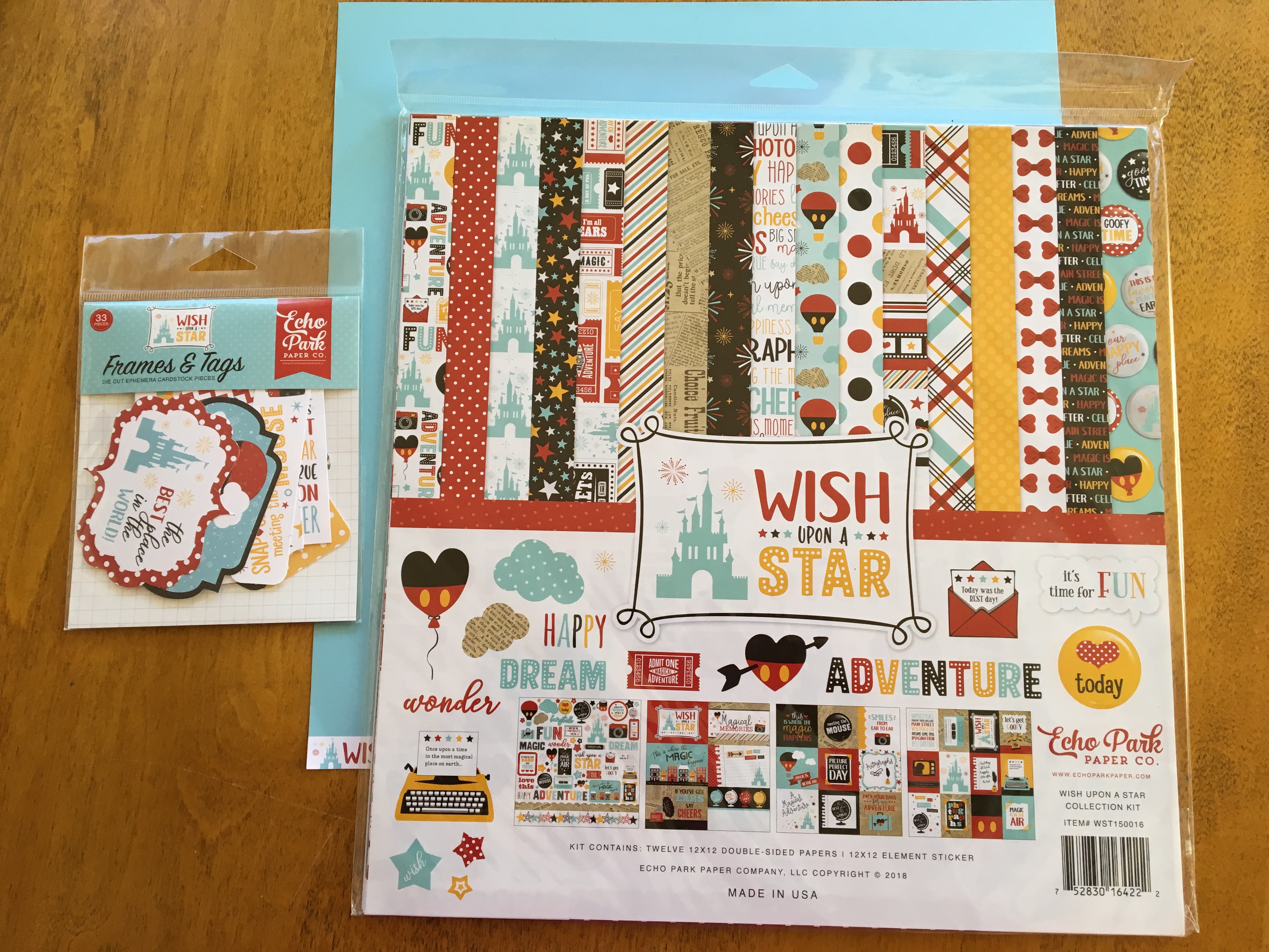
I chose a few papers from the Witches and Wizards collections from Echo Park to begin the layout. I then added a few pieces from my scrap basket. I had a bit of trouble figuring out what to use as the background paper. Cream didn’t quite work. White was, well, too white. I didn’t want to go with a color that would make the overall layout too dark.

So, it was time to do something I almost never do. I took out some ink and spray to grunge it up a bit. I chose a white textured paper as the background. Normally, I opt for smooth white cardstock, but I wanted the texture to show up through the ink and spray. First, I sprayed the upper left and lower right corner with gold. I am going to be honest, it didn’t turn out like I had planned. The spray had been sitting for years, and had separated. Though I tried to mix it, what came out was more brown than gold. After an initial freak out, I decided just to go with it. I then used a stencil and some blue Distress ink to dirty it up some more. (Hey, if you make a mistake, lean into it.)

With the background ready (after drying of course), the papers were placed pretty quickly. It’s so much easier and faster when you are using a sketch! To add interest to the paper strips, I used a fun border punch. In order to give the photo more weight, I placed a lot of layers beneath it. Of course the star paper had to be on full display! I love how the two Witches and Wizards collections work together. I do mix and match my papers, but some days, I just don’t want to have to think about it.

As usual, embellishing gave me trouble. I went through my Witches and Wizards diecuts, and honestly, I was a bit frustrated. There are just so many phrases and so few icons. It’s a trend I’ve noticed over the last couple of years. So, words and phrases were chosen. Then I placed the stars. That left me with a lot of space below the photo. I had no idea what I was going to do with that! Then I started digging through a drawer of random embellishments, and I found that brown flourish. The color matches. It fits perfectly. Let’s do it! (Which seemed like a good idea until I realized that after it had sat for 10 years, the glue was all gummy. I made it work, but… ick.)

Next I filled the top with the title. I purposely chose a fairly large alphabet that would use the space well. And… in a spirit of full disclosure… this particular title was chosen in order to fit nicely. Also, I purposely chose the word “wizards” instead of “witches.” Why? Well, I wanted to use the “z.” All of you scrapbookers know how rarely we have a chance to use this letter. This was my chance!

I do like the final layout. It isn’t perfect, but it allowed me to stretch my creative wings a bit. I don’t think anyone would know that things started off rocky and needed to be fixed. That alone will encourage me to use my sprays and inks more in the future.

Scrapping With Collections

I have a problem.  I buy paper collections.  Okay, so that doesn’t really sound like a problem.  It’s just that I don’t USE collections.  Even the Disney collections that I purchased for our trip are rarely used as I scrap Disney layouts.  I think I like the idea of a collection, but prefer to pull individual papers from various companies to scrap a page.  There have been some exceptions to the rule.  Once in a blue moon, a collection comes along and just calls to me.  There are 3 collections that I love so much, that I’ve used just about every tiny little piece of them.  Fancy Pants’ “What a Wonderful Day,” Echo Park’s “Everyday Eclectic,” and Echo Park’s “We are Family” inspire me.

I pulled the few papers I had left from “We are Family” in order to make this layout.  I am down to literally pulling scraps.  See that green piece and the blue polka dot paper?  Yeah, that’s all I had left of those.  I love how Echo Park made their papers work together.  Yes, that is the point of a collection.  However, too often, collections have papers that actually DO NOT go together.  I was able to pull my last few scraps, and they magically coordinated without any work from me.Sweet Times

I chose to finish off the collection because I felt they matched my photos so well.  The flower paper works with the floral pillows.  The blues and teals match the decor and the clothing of my family.  (No, I didn’t make them wear clothes to match my paper.  There are some people that do that!)  I also chose this collection because it brings me joy.  The people I love should be documented using products that make me happy.

The layout is a pretty typical style for me.  It’s really just strips of papers going up the page.  I cut the floral paper down so it wasn’t as wide.  Then two matted 4 x 6 photos were placed on top.  I added a journaling card to the side.  My embellishments travel down in a diagonal in order to draw the eye to the photos.  I did use some stickers from the collection, but then added die cuts and chipboard pieces from others.  It’s nothing super fancy.  Still, look how eye-catching it is.  That’s the sign of a good collection.

New Supplies

Do you remember how fun it was to get new school supplies when you were in school?  There was nothing better than picking out the newest style of Trapper Keeper.  (Yes, I am fully aware that I am giving away my age.)  Now that I am a teacher, the shine has worn off a bit.  (No one wants to see back to school commercials the week after school gets out!)  I think it may be even worse for parents.

Today I feel that same sort of excitement when new scrappy supplies arrive at the door.  The most fun for me is that I have often forgotten what I ordered.  There is a wonderful company that will hold your order until you’ve met their $100 threshold for free shipping.  So, over the course of many months, I order here and there until finally the package gets shipped.  It’s always a wonderful surprise.  This does mean that I may not be scrapping with the newest collections, but let’s be real.  Most of my scrapping uses older supplies.  What’s a few months when I usually scrap with things that are many years old?

Here are a few of my new acquisitions.

Disney1Disney2

Echo Park seemed to catch my fancy for this order.  In this case, I am preparing for a Disney trip.  You know, in case you couldn’t guess by these 2 Disney themed collections.  The first is in classic Disney colors.  I like that the color scheme is pretty versatile.  Chances are, I will be using the B sides that are a bit less busy.

The second collection has an Alice in Wonderland theme.  I honestly put these in my cart, took them out, put them in, took them out… You get the picture.  The colors aren’t quite me and the papers are *extremely* busy.  So in this case I only ordered a few papers and then the matching solids.  I am hoping that the solids will help break up and tone down all of that pattern.  After ordering it, I realized that now I HAVE to meet Alice during our trip.  What good does Alice paper do if you don’t actually meet Alice?  Oh, the sacrifices I make!

Echo Park pink floral

Sticking with the Echo Park lines, I also picked up just a bit of the “Just Married” collection.  Really it is only this beautiful floral and some solids.  That light blue solid is from a different collection, but I kept it together just in case I choose to use it on the same layout.  I really love that sweet floral.

Cat papers

This is a mishmash of various cat papers.  When half of your layouts involve cats, well, you buy cat papers.  That top paper just makes me grin.  I am a big fan of whatever genius decided to put glasses on cats.  Are those cateye glasses?  I love it.

Kaisercraft holiday

Lastly, I have these Kaisercraft papers.  The top and bottom papers are from the same collection.  The two in the middle are from 2 additional collections.  Dear manufacturers, I love when you do this.  When you repeat colors in various collections, I can mix and match to my heart’s content.  I will definitely be using the pink wood grain with at least one of the holiday papers.

There was a lot more in my box of heavenly goodness.  Many of the papers are stand alones.  I often purchase something that I love and then see what in my stash will go with it once it arrives.  At this point, there is always something in my stash that will work.  Perhaps I need to stop shopping.

Sometimes You Need a Sketch

I have been complaining about how all of my layouts look the same.  It is so easy to fall into artistic habits.  You have even seen me attempt to break out of those habits and fail miserably.  It just seems that once I start creating, I end up repeating what is familiar.

Finally, I found a way (for now) to get out of that scrappy slump.  I chose a sketch that is decidedly not my style.  In this case, I pulled up an old sketch from the My Mind’s Eye Blog.  You can find it here.  It is a bit minimalist in that it doesn’t use a lot of patterned paper.  You know how much I love patterned paper.  I usually use it for the background as well as whatever other paper layers are on the page.

Now don’t get me wrong.  You will see lots of different patterned papers on this page.  It’s just that they are in smaller bits.  This sketch is absolutely perfect for using up your scraps!  That is exactly what I did.  Everything except the white cardstock background came from my scrap bin.

the-rock

In this case, I started with the triangle paper from Pink Paislee’s Memorandum collection.  I have to admit, that is one of my favorite collections.  As this particular paper shows, the collection included just about every color in the rainbow.  It made it very easy to pick out coordinating scraps.  Just about any color was fair game.  It allowed me to mix brands quite easily.  I believe I see Simple Stories, Bella Blvd, Echo Park, and American Crafts represented here.

Really, this page came together pretty fast.  It didn’t need a lot of embellishing thanks to the many different patterns.  I pulled a few chipboard shapes from the Posh line.  In order to repeat the circles, I also used some brads.  You can’t even believe how happy I am to use some brads.  Buying brads is a special talent of mine.  Using them is not.  For once, I really enjoyed the free form style and just went with it.

Do you want to know what I really like about sketches?  You can use them over and over.  I’m already thinking about turning this one on its side and using a horizontal photo.  Oh the possibilities!

bird

Summer in January

In the midst of the shortest days of the year, I find myself craving the sun.  I want to feel the warmth on my face.  I want to go outside and enjoy the day.  I want to hang out with friends and play frisbee golf badly.  (Just to be clear, *I* play badly.)  Instead, I’m looking out the window at overcast skies and freezing temperatures.

One way to fight those wintertime blues is to scrap like it is summer… or at least scrap those summer pictures.  I like bringing back memories of summer vacations and lazy days.  To be honest, I also like scrapping with a summer palette.  Nothing says summer like bright colors.

In this case I decided to grab the “We Are Family” collection by Echo Park.  It was that vibrant green I needed.  I know it’s a tone on tone B side.  But look at how happy it is!  I matched it up with a dusty blue polka dot for contrast.  Then I chose the multi-color chevron for the background. I have a lot of chevron patterns in my stacks, but there is nothing like this paper.

the-best-day

When it came time to embellish, I knew I needed a bit more drama.  That red scallop border sticker at the bottom really helped.  Then it looked funny when I didn’t have any red on top.  (I really think scrapbooking is the act of fixing the problems I create.)  Though I didn’t have any more red border stickers, I did have some red Bo Bunny ribbon that I purchased ten years ago.  (This is why I don’t purge my unused supplies.)

clouds

The rest of the embellishment is pretty straightforward.  I looked through the sticker sheet that came with the collection and pulled the banner as well as the title.  No, it probably wasn’t the best day of my life, but it was a good day.  (There are so many supplies that refer to something as being the best day.  Really, don’t you only have one best day?  So sometimes you just have to use those supplies on a good day.)  I added the little gnome and the “happy” from the Simple Stories “Bloom and Grow” collection.  Then I dug out the chipboard clouds and butterfly.  A few sequins scattered around, and I was done.

This layout is clean and simple.  Still, it makes me happy.  It’s my little ray of sunshine to look at as I sit here drinking my tea.