Visiting the Frontier(land)

On my second trip to Disneyland I was 9 years old. (No, I won’t tell you how long ago that was.) My absolute favorite ride was Big Thunder Mountain Railroad. I remember riding it multiple times sitting beside my dad. Whipping around the corners made me laugh nonstop. I loved all of the iconic scenes, and I was all about the western theming.

So, this ride was a must do for my husband and I on our trip to Disney World. I was a little disappointed that it was closed down when we first arrived at Magic Kingdom. However, there was a brilliant upside to the situation. Look at these photos! Since the ride was down, there were very few people in the area. My husband and I were able to get some great shots with the beautiful Big Thunder Mountain landscape. We were also able to ride it later in the day, and again on another evening. In the end, it was a win for us.

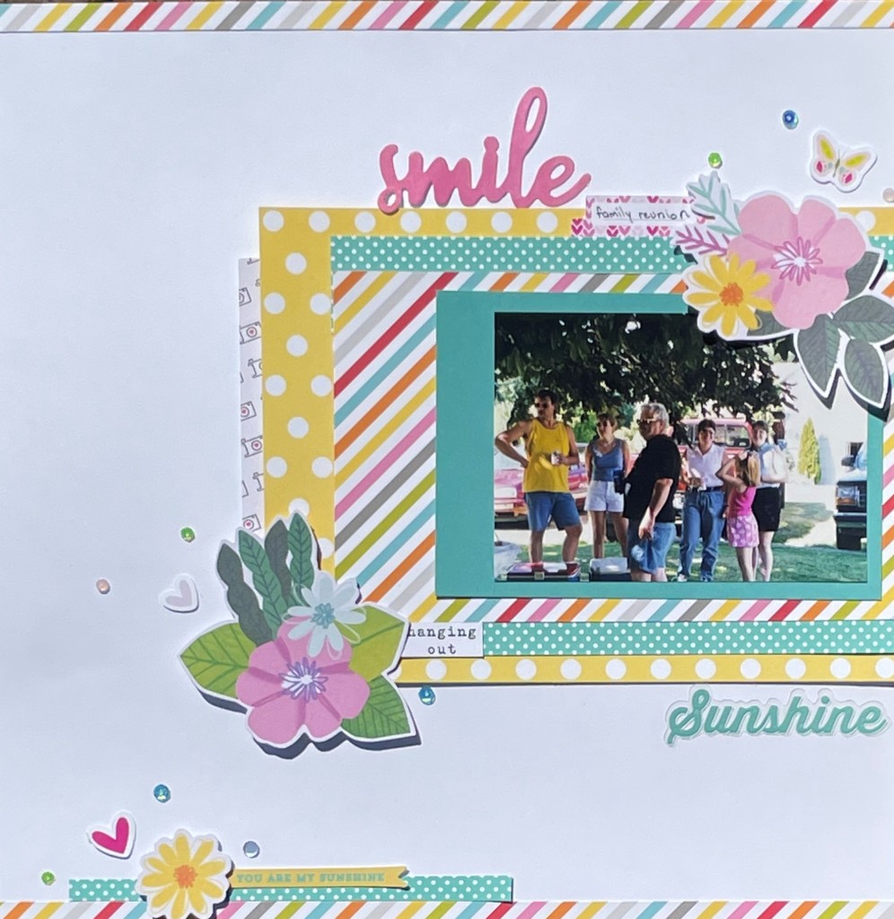
Choosing papers for this layout was relatively easy. I chose the orange of the mountains and the red of the walkway. A kraft background seemed right for this old west layout as well. I do wish I had added a small strip of dark brown at the top and bottom of the orange paper. It just needs some definition between the orange and the kraft. My one real struggle was that I only had one of each of the papers. That meant I had to do some careful cutting in order to make sure that I had enough paper for both pages.

Once all of the papers and photos were placed (thank you page sketch), I was stuck. If you have followed my blog at all, this will not be a surprise. I normally don’t have a plan beyond the papers and photos. I had just received Simple Stories Say Cheese at the Park line. So, I immediately went through to find all of the Big Thunder cut-aparts, stickers, and ephemera. FYI, there is a lot of overlap between the sticker sheet and ephemera pack. I am fairly certain that I need to plan another Disney trip in order to use up what I have left. I really like that I had a cut-apart card for each side of the layout. It helps balance it out.

Before placing any of the embellishments, I did something very uncharacteristic for me. I actually chose the alpha Thickers and placed my title. That gold chunky alphabet is just perfect for this layout. It has the presence that the layout needed. And I mean, it’s gold, for a western mine themed ride. I did do a bit of fussing with the goat card and mountain die so that I could make sure my title worked with those two elements.

I then did a trial and error process for placing other embellishments. I knew that the “Hold onto your hats” tag had to go on this layout. I was *just* able to squeeze it in beside the title. No, that wasn’t careful planning… it was sheer dumb luck. That left an awkward space after “Big.” So, I searched the sticker sheet and decided that the cactus would fit there nicely. The right side was a little easier. The goat diecut had to sit at the top. The wanted poster was the perfect place for journaling, and fit well in the space beneath the goat. I felt something needed to go next to the bottom right hand photo. It’s like I needed that space to be taken up so that the wanted poster had a base to sit on. (Okay, so not literally since they don’t touch.) Lastly, I scattered a few puffy stars.

This is a layout that I am very happy with despite a few flaws. The photos are great. The papers match the colors almost perfectly. I honestly couldn’t be happier with the Say Cheese at the Park embellishments. I rarely use cut-apart cards, but they really help pull this layout together. I absolutely love them.

Disney tip: Rides do break down. It’s important not to have the joy of your trip dependent upon experiencing a certain attraction. There are so many reasons why you may not be able to do that one special ride. If it’s an outdoor attraction, rainstorms could cause it to shut down. A ride also may be being refurbished, meaning it could be out of commission for weeks or even months. I’ve even seen power outages take rides down. These aren’t things that you can really plan for. (Refurbishments may be announced early, so you might be able to plan around those if you aren’t planning more than 6 months in advance.) If you get to do most of what you are looking forward to doing, call the trip a win. Even with careful planning, a few of the items on our list just didn’t fit into our trip. We also had some experiences that we didn’t plan. Be flexible, and enjoy everything that you can.

Going Retro

I’ve been cleaning through my home in order to get more organized. I feel like I could either write an entire series of posts on this, or start a whole new blog. I could call it something catchy like “Packrat Undone.” I had a better title, but it appears there’s already a book with that exact same name. I guess I’m not a creative genius after all. Anyway, I found a box of photos that ranged from the 70’s to the 90’s. It was time to pull some photos out of the past and begin making pages.

I wasn’t really sure how to start this layout. The colors in the photo are all over the place. We are definitely not one of those families that wear matching clothes. This photo has green, yellow, black, blue, red, and pink. What do you do with that? You find a rainbow striped paper which lets you go in any direction you want. In this case, I decided that yellow and pink would work well. They were the two colors that stood out the most to me. I also added some turquoise. No, it’s not in the photo, but it is in the striped paper.

This is one of my favorite kinds of scrappy pages. It’s one where I simply raided my scrap bin for all of the papers. I have scrapbooked so much lately, that the actual scraps have been piling up. This was a nice change from cutting into new papers. It’s also proof that scraps can make some outstanding layouts. I had someone ask me what paper line I used. I can identify the turquoise polka dot from Echo Park’s Dots and Stripes collections. I believe the turquoise paper behind the photo is from Simple Stories. I’m not sure about the other papers.

For this layout, the focus is an offset block of stacked paper. I do love me a good layered paper layout. Admittedly, I did do a bit of cheating. That turquoise polka dot paper? What you see is all I had of that. I cut it into thin strips, and placed it above and below the striped paper, making it look like a larger scrap. The little bit of camera paper peeking out the left hand side is really a 3×4 journal card. Careful placement just gives the appearance of a larger piece. Sometimes a little optical illusion can stretch your supplies.

When it came to embellishing, I immediately reached for my die cuts. I was looking for pink and yellow. There were some great flowers that fit the bill Shimelle’s Never Grow Up collection. I then added in some smaller bits from a variety of die cut packs. I was just looking for colors that matched. Recently I’ve fallen in love with Simple Stories’ Simple Pages Page Pieces. No, I don’t use them the way that I’m “supposed” to use them. I use them like any other pack of die cuts. The little hearts and butterfly came out of Page Pieces pack. My title pieces came out of 2 other embellishment packs. The final touch was a few colorful sequins sprinkled around. This is another new obsession of mine. Catherine Pooler’s sequin mixes are my new go to for finishing off my layouts.

In the end, this is one of my favorite recent layouts. Old family photos need a little love too. I think this is just the beginning of scrapbooking the past. Totally radical, right?

The View

There are a million wonderful things about Disney World.  One of my absolute favorites is the dining options.  You see, I am allergic to dairy.  It’s not the, “This makes me uncomfortable,” kind of allergy.  It’s the, “Where’s the hospital?” kind of allergy.  In general, eating out simply isn’t safe for me.  The magic of Disney dining is that they have options safe for those of us with severe allergies.

Since dinner out is a special treat, we definitely splurged on this trip.  One of our special meals was at the California Grill.  I won’t lie, it was spendy, but so worth the expense.  I ordered a vegan meal that I swear could feed 3 people.  I’m not vegan, but the options sounded so good, I decided to give it a go.  The food was delicious.  I had a flatbread with pears that was to die for.  It was accompanied by a truffle pasta dish that kept me coming back for more.  Believe it or not, that was just half of the meal!

Though the food was incredible, it was the view that will guarantee my return.  Thanks to a little Disney magic, we were seated next to the window.  We looked directly out onto the castle and Tomorrowland.    I loved spending a relaxing evening gazing out on the Magic Kingdom.  Even my husband, who has never been a Disney fan, was impressed.  He took the photo that I decided had to be scrapped

The View

The photo itself doesn’t have much color to it. I chose the blue background to match the little bits of blue on the castle.  The red heart in the lower right hand corner is part of the background paper, so I found a matching red scrap that formed the banner beneath the photo.  I also wanted to make sure I was using the cut apart sheets from Say Cheese II by Simple Stories.  I have such a difficult time using cut aparts on my pages.  This notebook lined paper cut apart was good for a bit of journaling, so it was perfect for the page. I then added a scrap of grid paper to place behind the photo.

When I placed all of the papers, they blended into each other too much.  I decided to ink the edges to make them stand out.  I am not a neat inker.  In some ways I like the distressed look it gives.  The perfectionist in me just sighs, though.  Maybe I should have outlined each piece using a ruler and a black marker.  Then again, I usually make a disaster of that too!

After that, it was time to place the title and embellishments.  You all know that’s the bane of my scrappy existence.  You know what?  I actually like how I embellished this layout.  That just about never happens!  The upper left is simply embellished with a die cut piece that I popped up with foam adhesive.  A few tiny glittery hearts finishes off that cluster.  I am really pleased how the bottom right turned out.  In this case I became a renegade and broke all of the rules.  Okay, I broke one rule.  My embellishments don’t touch.  They just float.  The castle helped fill the empty space next to the title.  Then I added the cloud to help bridge the space between the castle and the photo.  It works well, because clouds float!

Disney tip:  If you eat dinner at the California Grill, you can watch the Magic Kingdom’s fireworks from the restaurant or a reserved viewing area at the top of the Contemporary Resort.  We ate at 5:00 and could have returned a few hours later to watch from the viewing area.  As this was our first trip, we didn’t opt to go back.  Instead we waited an hour on Main Street in order to find a good spot to watch the castle projections as well.  Next time we may make reservations closer to the fireworks show time and forgo the hour of standing shoulder to shoulder with a mass of people.

The Paper’s So Bright

I don’t do a lot of super bright scrapbook pages.  When you live in the dark and dreary Pacific Northwest, bright colors just don’t work with a lot of your pictures.  I really liked the look of the DIY collection by Simple Stories when I bought it online eons ago.  However, once it arrived, I realized how bright the B sides are.  Since I do a lot of B side scrapping, I’ve had some trouble using this collection.  For the most part, it’s been sitting untouched on a shelf.  It was time to get it onto a page.

My first challenge was to find some appropriate photographs to go along with those neon colors.  It really didn’t take much digging to find some water photos that featured bright yellow kayaks.  Yes!  That would work perfectly… well, almost perfectly.  I knew that the red life jacket would clash with the pink that I had in mind.  You know what?  Rules are made to be broken.

Today

I knew I wanted a patterned paper to tie everything together.  Though flowers may not be the first thing you think of when kayaking among the dry hills, I chose it anyway.  (Yes, I am in full on rebel mode it seems.)  Not only did it contain all of the colors in the collection, but it was on a black background.  The water in the top photo is so dark that it looks black.  I felt it connected the colors of the photo back in with the colors of the paper.  Additionally, I matted the photo with green.  The dark pictures on top of the dark paper didn’t work well.

I swear that I never have embellishments in the right colors.  It took me some digging to find the right things for this page.  First I found the bright pink journaling card.  I couldn’t believe how the flowers on the card matched with the collection.  It was almost like it was meant to be.  Then I found the tag and pieces for the top cluster.  It always amazes me when I can put together a cluster made from multiple different collections.  The bottom circle cluster was a bit more difficult to make work.  I liked the globe from one of Shimelle’s collection.  This certainly was an adventure for me.  Then I found the “happy DAY” sticker.  And then I couldn’t find anything else.  Finally, I decided to punch a circle out of the paper I used for the mat.  It looked much too plain.  After quite a bit of trial and error, I decided to add that bright pink brad.

You may have noticed that this page has no title.  I decided to omit one for a couple of reasons.  First, I couldn’t find a good placement for it.  My gut told me to put it up in the yellow at the top, but that just looked funny.  Another option was in the sky portion of the bottom photo.  I thought it interrupted the beautiful symmetry.  (Forgive me.  I am a math teacher.  I love symmetry.)  In the end, I decided the page has plenty of words without the addition of a title.  Who says every page requires a title anyway?


Just a Cat and Some Scraps

I know this is quite a simple page, but I thought I would share it anyway.  This is the result of a scrap bin diving session.  My scraps are once again getting out of control.  Whenever that happens, I like to make a page or two out of scraps.  I wish I could tell you that the bin is no longer overflowing, but that would be a lie.  A really big lie.

This layout started with the floral scrap from Simple Stories.  Oh, how I love that paper.  It makes the perfect jumping off point because it has so many colors.  I dug through the rest of my scraps to find a harvest gold, a teal, and a brown.  Don’t you just love fall colors?  I added in a scrap of kraft cardstock before finding a dark red background.  I layered up the boxes of papers without even really having to trim anything.  That never happens!


Good Day

I knew my embellishing was going to start with those brown corrugated pieces.  They have been in my collection forever.  I love their texture, but rarely do they fit with my color scheme.  Here, they were a great match.  The hearts came next because I love that kitty!  Look at his sweet little face.  The copper hearts and title come from Shimelle’s Go Now Go collection.  I finished it all off with a few Simple Stories stickers.

Though this layout isn’t fancy, I still love it.  There is nothing extraordinary about it.  In fact, the Thickers are the only thing on this page that hasn’t been sitting in my stash for years.  I almost think that makes me love it all the more.  Old supplies don’t have to look or feel old.  They deserve to be dusted off and used to make beautiful things.

On a Roll

I actually managed to scrapbook for a second week in a row!  That hasn’t happened in months.  It appears that insomnia is my friend.  No sleep equals extra crafting time.  See, you should always look on the bright side.

This week’s layout started in such an odd way.  I wanted to start with a journal card that is designed for Project Life style scrapbooking.  This happened to be one of those cut apart cards that seem to be all the rage in collections these days.  The cut apart sheets just vex me since I don’t do pocket scrapbooking pages.  (Well, there was that one time.)  So I was determined to use one on my next layout.

I am home

From there I chose this photo.  I actually really love this photo (which for some reason looks bent, but isn’t.)  I have a secret love affair with Torrid clothing and Starbucks.  Okay, maybe it isn’t so secret.  It certainly isn’t a secret from my credit card company.  They are my kryptonite… along with scrapbook supplies.  So really, this is a layout of all my favorite things.  The day this photo was taken, I was a very happy woman.

Then it was time to choose my papers.  I immediately picked that bold black and white stripe to go along with the ombre pink card.  Let me just say, I love Bella Blvd.  You know that cover sheet in paper collections that shows what is in the collection?  This is the back side of that paper!  Finally a company is utilizing that cover sheet!  Next, I dug into my 6×6 papers to find the two triangle papers.  Does anyone else find their 6×6 pads multiplying?

Once the papers and photos were in place, I pulled out the die cuts from the Simple Stories “I Am” collection and the Bella Blvd. “Oh My Stars” collection.  I settled upon a diagonal design with mainly stars going across the page.  At that point there were entirely too many hard edges.  I threw in a little circle die as well as a doily to soften it a bit.  (The doily is just cut into 2 pieces.  I’m always looking for ways to save money.)

I must confess… titles are not my strong point.  They are always an afterthought.  In this case, I had a pretty large empty space at the bottom of the page.  Then I remembered… I had a package of giant gold glitter words from Pebbles.  I knew I was going to use the “I am” at the top.  The word “home” just struck me.  Though it may not seem logical to anyone else, it was the perfect title for me.  I feel most relaxed and at home in my comfy Torrid sweater while drinking coffee.  It makes me happy sigh just thinking about it.

I love this page.  It isn’t the most innovative or pretty page I’ve ever created.  I think it reflects me, though.  It’s a little bit shiny, a little bit scattered, and features the things I love.  Now on to the next scrappy escapade.


National Scrapbooking Day… A Day Late

Yes, I am aware that NSD was yesterday.  I promise that I really did celebrate on time!  Okay, I celebrated after I got through with being an adult for the day.  My husband seemed to be blissfully unaware of the importance of NSD when he scheduled appointments for us.  The nerve!

Once home, I ran up into the crafting room and looked at my supplies.  With Mother’s Day quickly approaching, making a card was my first priority.  I happened to have some Simple Stories Posh die cuts sitting out on my desk from a previous project.  I chose two to use for cards.  The florals and soft colors were perfect for this particular occasion.

It didn’t take very long to dig through my scrap bin to find some matching papers.  I have a plethora of aquas, teals, pinks, and yellows.  At that point it was just a matter of stacking up a few rectangles and positioning the die cuts.  Each card has a smattering of enamel dots, pearls, or sequins to finish it off.  In all, I made 3 cards in under an hour.  (The 3rd is super simple in a fall color palette.)  I think that is a record for me.

The bicycle feels like an appropriate motif for my papercrafting lately.  I need to keep pedaling on and creating.  Though I am not doing anything that is cutting edge, I feel the momentum going in the right direction.  And hey, it is so much fun playing with the pretty products!  That is the important part.


Long Time No Scrap

It has been far too long, I know.  At this point in time you probably thought I had given up the blog.   Though I would like to tell you an exciting story about being off on some great adventure, the truth is just that life got in the way.  Work got the better of me for a while and took up all of my time.  Then a bout of bronchitis kept me from my beloved scrap room.  Those two things paired with a lack of creativity resulted in months of no scrappy escapades.

This weekend I finally returned to playing with pretty papers.  The result is a bit meh, but it is an important first step to getting my groove back.  I need to keep cranking out the projects until a brilliant idea strikes again.  It will happen.  It just takes time.

Today’s installment features a bit of a fuzzy photo of a scrap busting design.  You know how I hate to throw any scraps away.  So I rummaged through my scrap bin and pulled out pinks, teals, greens, and blues.  One piece in particular caught my eye.  It’s that multi-colored dot print behind the photo.  Doesn’t it just say birthday to you?

Forever Sweet

Going with the birthday theme, I found a photo of this beautiful birthday cake.  (That cake is vegan! Can you believe it?)  I didn’t have any other photos to go with this one.  Placing a small 4×4 photo on a 12×12 page is a challenge for me.  I know there are some beautiful pages out there that use one small photo on a large page.  The artists are masters of using white space.  I am not one of those masters.  So instead, I decided to fill my space with those paper strips.

I am quite fond of paper strip layouts.  They don’t require a whole lot of fuss.  Nothing has to be lined up exactly.  The paper can be in a variety of widths.  And, of course, it is a great way to get rid of those scraps.  I was even able to throw a couple of branding strips into the mix.  It only took a few minutes to layout the strips in a purposely uneven manner.

Then it was time to work on the top of the layout.  I double matted the photo so it had a bit more weight.  That left some room for a fairly large title to the right.  At first I was going to lay the silver Thickers right onto the background paper.  The silver blended into the white and was too difficult to see.  Rifling through a die-cut pad, I came upon the turquoise piece.  It wasn’t the exact color I was looking for, but sometimes perfect is over-rated.

Finally it was time to add in some embellishments.  I started with the silver leaves.  Leaves logically need flowers.  Immediately I knew the Simple Stories’ Bloom & Grow collection was exactly what I needed.  A few flower die-cuts later and some puffy stickers from Pinkfresh Studio and I was done.

It feels good to be back in the saddle again.  Stick with me.  I plan for this to be quite the ride.

Sometimes You Need a Sketch

I have been complaining about how all of my layouts look the same.  It is so easy to fall into artistic habits.  You have even seen me attempt to break out of those habits and fail miserably.  It just seems that once I start creating, I end up repeating what is familiar.

Finally, I found a way (for now) to get out of that scrappy slump.  I chose a sketch that is decidedly not my style.  In this case, I pulled up an old sketch from the My Mind’s Eye Blog.  You can find it here.  It is a bit minimalist in that it doesn’t use a lot of patterned paper.  You know how much I love patterned paper.  I usually use it for the background as well as whatever other paper layers are on the page.

Now don’t get me wrong.  You will see lots of different patterned papers on this page.  It’s just that they are in smaller bits.  This sketch is absolutely perfect for using up your scraps!  That is exactly what I did.  Everything except the white cardstock background came from my scrap bin.

the-rock

In this case, I started with the triangle paper from Pink Paislee’s Memorandum collection.  I have to admit, that is one of my favorite collections.  As this particular paper shows, the collection included just about every color in the rainbow.  It made it very easy to pick out coordinating scraps.  Just about any color was fair game.  It allowed me to mix brands quite easily.  I believe I see Simple Stories, Bella Blvd, Echo Park, and American Crafts represented here.

Really, this page came together pretty fast.  It didn’t need a lot of embellishing thanks to the many different patterns.  I pulled a few chipboard shapes from the Posh line.  In order to repeat the circles, I also used some brads.  You can’t even believe how happy I am to use some brads.  Buying brads is a special talent of mine.  Using them is not.  For once, I really enjoyed the free form style and just went with it.

Do you want to know what I really like about sketches?  You can use them over and over.  I’m already thinking about turning this one on its side and using a horizontal photo.  Oh the possibilities!

bird

Summer in January

In the midst of the shortest days of the year, I find myself craving the sun.  I want to feel the warmth on my face.  I want to go outside and enjoy the day.  I want to hang out with friends and play frisbee golf badly.  (Just to be clear, *I* play badly.)  Instead, I’m looking out the window at overcast skies and freezing temperatures.

One way to fight those wintertime blues is to scrap like it is summer… or at least scrap those summer pictures.  I like bringing back memories of summer vacations and lazy days.  To be honest, I also like scrapping with a summer palette.  Nothing says summer like bright colors.

In this case I decided to grab the “We Are Family” collection by Echo Park.  It was that vibrant green I needed.  I know it’s a tone on tone B side.  But look at how happy it is!  I matched it up with a dusty blue polka dot for contrast.  Then I chose the multi-color chevron for the background. I have a lot of chevron patterns in my stacks, but there is nothing like this paper.

the-best-day

When it came time to embellish, I knew I needed a bit more drama.  That red scallop border sticker at the bottom really helped.  Then it looked funny when I didn’t have any red on top.  (I really think scrapbooking is the act of fixing the problems I create.)  Though I didn’t have any more red border stickers, I did have some red Bo Bunny ribbon that I purchased ten years ago.  (This is why I don’t purge my unused supplies.)

clouds

The rest of the embellishment is pretty straightforward.  I looked through the sticker sheet that came with the collection and pulled the banner as well as the title.  No, it probably wasn’t the best day of my life, but it was a good day.  (There are so many supplies that refer to something as being the best day.  Really, don’t you only have one best day?  So sometimes you just have to use those supplies on a good day.)  I added the little gnome and the “happy” from the Simple Stories “Bloom and Grow” collection.  Then I dug out the chipboard clouds and butterfly.  A few sequins scattered around, and I was done.

This layout is clean and simple.  Still, it makes me happy.  It’s my little ray of sunshine to look at as I sit here drinking my tea.