Pandora Love

I apologize for the long gap between posts. My life first got busy, and then it got impossible. Without getting into too many details… hug the ones you love. A life can be upended in a moment, and you won’t ever see it coming.

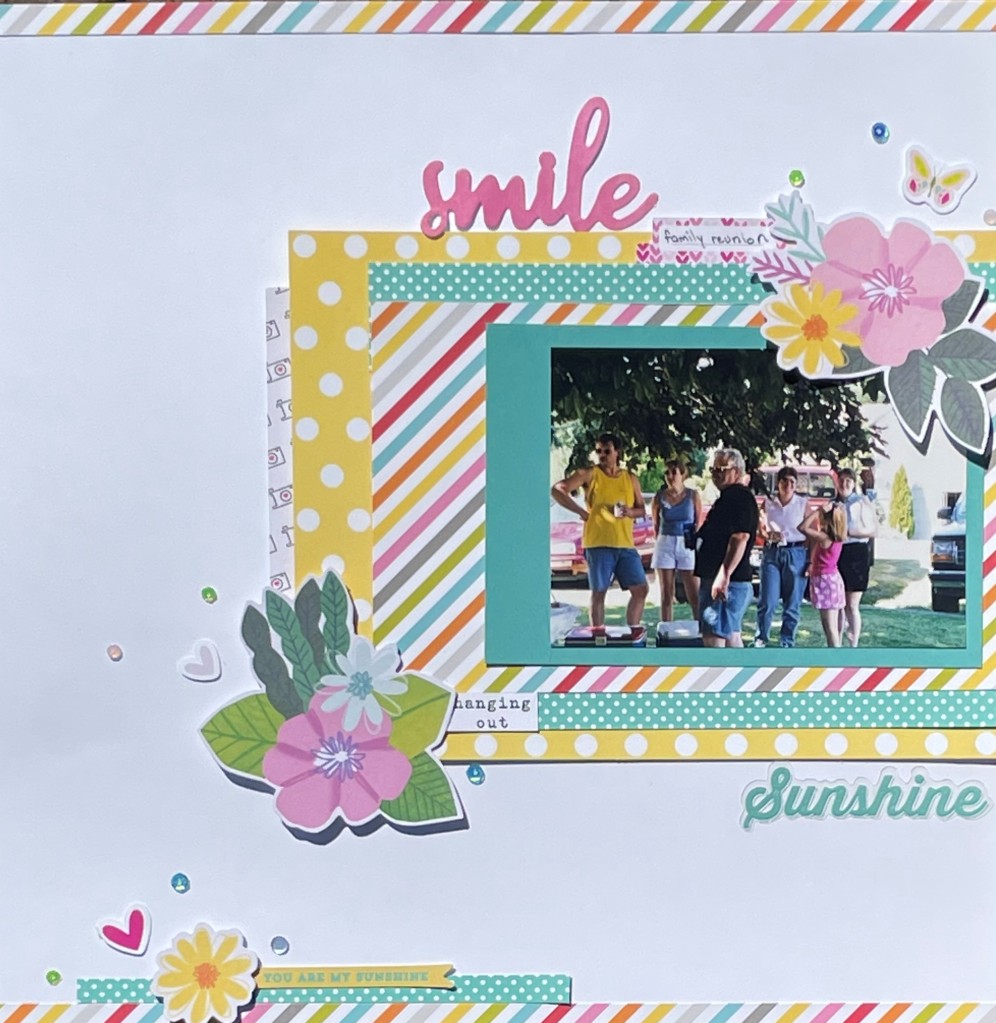
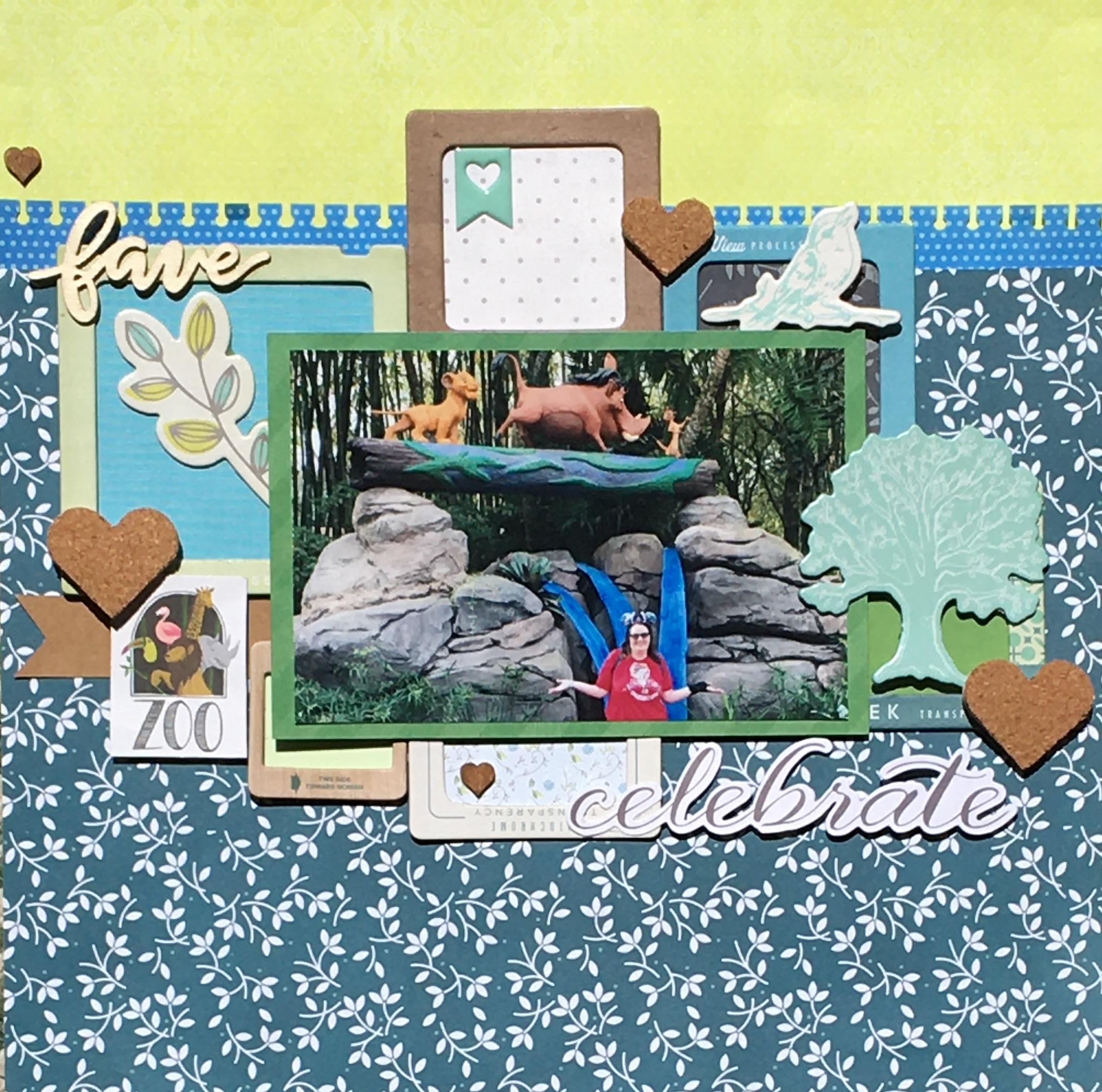
Now onto a more uplifting topic… scrapbooking the places I love. This layout was done quite some time ago. Though I can see some issues as I look at the layout now, I still love this basic format. What I really love about this layout is that not only did I get to use up scraps, but I got to use some old embellishments as well. This is really proof that old products can make for pretty nice layouts.

Let’s talk about the papers first. Other than the white cardstock, the other full sheet of paper used was the Webster’s Pages scalloped paper that peeks out at the top and bottom. I’ve had that piece in my stash for well over a decade. Even though you only see a bit of it, I was happy to get it onto a layout. All of the other papers were pulled from my scrap bin. I just rummaged through looking for browns, greens, and yellows. I didn’t have quite enough scraps in the right colors, so I added in a bit of ribbon as well.

The embellishments for this page are mostly ancient. I’ve had those butterflies for 10-15 years. I still love them so much. The Prima flowers are quite old as well. I did sneak in a couple of flowers that I made with punches because I didn’t have all of the colors I wanted. I dressed them all up with clear gems so that they would mesh well together. The only new items are the flower and word stickers. (Oh, and when I say new, those released 2 years ago.) I think those are from Vicki Boutin’s Fernwood collection. I did cut out the “Love” from a die I bought on Etsy. (I love that die.)

The basic layout of this makes my frugal self swoon. I can grab all of the odds and ends of paper strips that I’m often left with after using most of a paper. I refuse to throw them out. The best part is that this isn’t symmetrical. The strips on the left don’t line up with the strips on the right. That means I can mix and match to my heart’s content. I also have a decent stash of ribbon that has been sitting for years that can be incorporated into the design. It’s just the perfect design for busting scraps.

Disney tip: If you get the chance, visit Pandora both during the day and at night. In the daylight, you can appreciate all of the amazing details. This land is immersive. As a plant enthusiast, I loved seeing how realistic they made the environment. At night, the place literally glows. It’s a whole different incredible experience.

The Scariest Ride of All

What is the scariest ride in all of Disney World? Is it Tower of Terror? Could it be the speed and thrills of Expedition Everest? Maybe Haunted Mansion provides endless chills? No, none of those are correct. The real answer is Small World. Not only is a person subjected to that song for 14 minutes, but then you have to contend with all of those creepy dolls. That’s right, graves and ghouls are far less frightening than being surrounded by hundreds of dancing dolls. *shiver*

You may be asking why in the world (pun intended) would I ride It’s a Small World if it gives me the willies. I went for two reasons. First, my husband had never been to a Disney park, and this is a rite of passage. For the record, he will never go on this ride again, and I’m not sad about it. This also happens to be one of my mom’s favorite rides. She wasn’t there, and she isn’t a fan of Disney, but it just felt like the right thing to do. I remember her taking photos inside Small World when I was 5 years old. This page is for her.

This page was incredibly fun to make, despite my feelings towards this particular attraction. It all started with the multi-color pastel paper that was inspired by this ride. I pulled a bunch of scraps in green, aqua, and pink that matched. You know how I love scrap busting layouts. The design of this page definitely fits the bill.

As always with a two page layout, I started with a sketch. I picked this particular sketch because I only had one piece of that fantastic Small World paper. This sketch allowed me to stretch it across both pages. I was able to fill the rest of the area with strips of papers from my scrap bin. I also like how the single photo on the right side doesn’t look out of place. Despite being offset, it’s a fairly balanced layout. I loved how the sketch called for rounded corners of the paper strips. It softens the page a bit.

With papers chosen, cut, and glued, it was time for embellishing. Here’s the thing. The papers on this layout make it REALLY busy looking. There are various polka dots, stripes, geometric designs, and even a leaf pattern. I couldn’t add much without making it completely overwhelming. I started by making those three flowers from pastel cardstock and a couple of dies. An enamel dot finishes up each simple flower. Why did I choose flowers? If you have been through this attraction, you will notice that many of the decorations inside look like paper flowers cut out by children. With that, I added a couple of brads. That finished up the “empty” space on the right side of the layout. There wasn’t much room on the left side. I did place a couple of stickers that include the Small World facade and the little boat with flags.

Once the page was complete, I was ecstatic. And then a scrapbooker’s nightmare happened. I had this layout sitting on the table to photograph once it was sunny again. My dear husband brought in his dirty trail camera and sat it on my layout. When I saw it, I moved the camera to find dirt had scattered all over my layout. To say I was upset, was an understatement. The damage seemed to be mostly on the white cardstock. I ordered a sand eraser and attempted to “erase” the dirt spots. That resulted in damaged paper with slightly lighter brown spots. Finally, I took a deep breath and looked at it critically. The spots were spread out and could be covered. And that is how this layout wound up with sequins as well.

Lessons learned from this trip and experience: It’s a Small World was still as torturous as I remembered it being 20 years ago. Karma is real. Making my husband ride this ride resulted in a dirt spotted layout. If you are going to go on this ride, do so in California. The original is definitely the best version,

Going Retro

I’ve been cleaning through my home in order to get more organized. I feel like I could either write an entire series of posts on this, or start a whole new blog. I could call it something catchy like “Packrat Undone.” I had a better title, but it appears there’s already a book with that exact same name. I guess I’m not a creative genius after all. Anyway, I found a box of photos that ranged from the 70’s to the 90’s. It was time to pull some photos out of the past and begin making pages.

I wasn’t really sure how to start this layout. The colors in the photo are all over the place. We are definitely not one of those families that wear matching clothes. This photo has green, yellow, black, blue, red, and pink. What do you do with that? You find a rainbow striped paper which lets you go in any direction you want. In this case, I decided that yellow and pink would work well. They were the two colors that stood out the most to me. I also added some turquoise. No, it’s not in the photo, but it is in the striped paper.

This is one of my favorite kinds of scrappy pages. It’s one where I simply raided my scrap bin for all of the papers. I have scrapbooked so much lately, that the actual scraps have been piling up. This was a nice change from cutting into new papers. It’s also proof that scraps can make some outstanding layouts. I had someone ask me what paper line I used. I can identify the turquoise polka dot from Echo Park’s Dots and Stripes collections. I believe the turquoise paper behind the photo is from Simple Stories. I’m not sure about the other papers.

For this layout, the focus is an offset block of stacked paper. I do love me a good layered paper layout. Admittedly, I did do a bit of cheating. That turquoise polka dot paper? What you see is all I had of that. I cut it into thin strips, and placed it above and below the striped paper, making it look like a larger scrap. The little bit of camera paper peeking out the left hand side is really a 3×4 journal card. Careful placement just gives the appearance of a larger piece. Sometimes a little optical illusion can stretch your supplies.

When it came to embellishing, I immediately reached for my die cuts. I was looking for pink and yellow. There were some great flowers that fit the bill Shimelle’s Never Grow Up collection. I then added in some smaller bits from a variety of die cut packs. I was just looking for colors that matched. Recently I’ve fallen in love with Simple Stories’ Simple Pages Page Pieces. No, I don’t use them the way that I’m “supposed” to use them. I use them like any other pack of die cuts. The little hearts and butterfly came out of Page Pieces pack. My title pieces came out of 2 other embellishment packs. The final touch was a few colorful sequins sprinkled around. This is another new obsession of mine. Catherine Pooler’s sequin mixes are my new go to for finishing off my layouts.

In the end, this is one of my favorite recent layouts. Old family photos need a little love too. I think this is just the beginning of scrapbooking the past. Totally radical, right?

Using Up Old Materials

I buy far more scrapbooking supplies than I use. Shocking… I know. As a result, I honestly don’t even know what I have. One of the biggest mistakes I make is buying paper collections. I am simply not a collection scrapbooker. In the last decade, I’ve used up (mostly) 2 collections. One of them I purposely gave myself a “bust the collection” challenge in order to use it all. So, it was time to choose an old collection and see if I could get a bit of it used.

I am going to be real. I had very high hopes for getting at least 2 papers from the collection out of my stash. In the end, I used part of 1 paper. That’s right, not even a full paper from that collection was used in the end product. I chose that cute grey kitty paper. The other colors in the collection just didn’t work well with the colors in my photos. So, I found the light blue dot paper to match the carrier. I pulled the orange strip and navy block from my scrap bin. The moss green was a 6×6 paper. It always amazes me how little paper is actually needed to make a layout.

This isn’t my favorite layout. Three photo layouts rarely are. I think I prefer it when I have more space to play with. Once 3 photos are on a page, there’s just some small odd rectangles left for embellishing. I am also not in love with the whole orange and blue scheme. It makes sense. Orange cat + blue carrier = orange and blue layout. I know that orange and blue work together in theory. It just has never looked good to my eye. Sometimes you wind up going the direction your photos tell you to go.

I think my favorite part of this layout is using up old embellishments. The only thing on this layout that I purchased in the last couple of years is the blue tag. The flowers are all at least a decade old. As a bonus, I finished off the pack of metal flowers I purchased in my first year or two of scrapbooking. The stickers, gems, brads, doilies, and alphabet stickers have all been taking up space for years. This is why I rarely purge my materials. Eventually they find their way onto a page.

I am making it a goal to embellish a bit more than normal. I am pretty happy with how the embellishment clusters came out. They all include both layering and multiple textures. There’s paper, metal, buttons, gems, stickers, die-cuts, ribbon, and chipboard all represented on this layout. So, let’s call this page a win… even if it isn’t my prized work of art.

Good Again

I promised another round of the good, the bad, and the ugly. Wanting to start out the year on a positive note, let’s begin with the good. Of my three first layouts of the year, this is my absolute favorite.

You all know how I love a layout that allows me to use up scraps. This was the perfect layout for me to raid my scrap box. The only paper I cut into was the orange circle. Everything else were pieces I procured from the overflowing scrap basket. If I am counting correctly, that’s seven less scraps taking up precious space.

As you can see, it didn’t come together without a hitch. My mixture of perfectionism and insistence on eyeballing everything are incompatible at times. In this case, I placed my layers down until I was happy. Once everything was exactly as I wanted it, I began gluing. And… papers shifted. Things weren’t straight. I couldn’t live with it, so I tore it all up. As a result, you will see some wrinkled papers. You know what? I rather live with a few crinkles than things going this way and that. So much for perfectionism, right?

Embellishing this page was a blast. I don’t often say that. First of all, I had a huge range of colors to choose from, so pretty much anything would work. Because of that, I headed straight for my random bits and bobs that were left over from old collections. All of the die cuts are probably a decade old. This just made my heart happy, y’all. I added a few “newer” pieces with the chipboard banners and little stacked hearts.

My favorite “embellishments” are the title and that little tag to the left of the photo. The title for this layout is big and bold. I rarely think about the title until I’ve finished the page. In this case, I knew I had quite a bit of space to fill. For once, I got to pull out an oversized alphabet and make a statement. The tag doesn’t look like much. However, it pulls out to reveal some hidden journaling. Whenever I can hide my thoughts, and handwriting, on a page, it makes me feel like I have a secret. Don’t judge… or analyze. Give me these small rays of sunshine.

I adore the final product. The bright colors just make my heart sing. My subject makes my heart melt. And the ability to let perfectionism go and really appreciate the beauty of the imperfect makes my heart heal. Yes, I would say this fits in the “good” category.

Masculine Scrappy Card

As I was plunging through my scrap bin, I decided to create a card for a man in my life. The triangle scrap with the copper accents popped out at me. It’s both pretty and masculine. Further digging revealed a REALLY old brown scrap that I think has been around for a decade (don’t judge), and a piece of white cardstock. That was the perfect base for my creation.

I decided to use a design that I often employ. I generally use a card front just smaller than the card itself. Then I put a band across to split up the space a bit. Then I place a square or rectangle on top that will be the home of whatever embellishment I choose. It’s a simple design. Sometimes I will use a slight variation where I use two papers to create the card front. (The more scraps I can use up, the better!)

Once I had my papers chosen, it was time to figure out what to do. When I placed the papers, it was much too plain. So for the first time in over a year, I broke out my embossing folders. Some jaunty polka-dots seemed a good way to keep with the geometric feel of the card. Just that little bit of detail added so much more interest.

Then it was time to add in my embellishments. I definitely went super simple with this card. I found the present diecut that also sported some copper foiling. (I loved that this was also geometric when you looked at the four rectangles.) With that in place, it was still missing something. This time I reached for my ribbon containers and pulled out a white piece of ricrac. That was all of the decoration that this card needed. I decided to forgo the obligatory “Happy Birthday” sentiment. I always struggle with placement. Since they are often stamped, my shaky hands also create smeared words. So for today’s card, less is more.

Scrap Cards

Scrapbookers know how quickly scraps seem to multiply. One moment you have everything organized and under control, the next there are papers everywhere. Storage containers inexplicably begin to overflow in a blink of an eye.

I pride myself on keeping my scraps tamed. When I scrap, I rifle through my scraps for nearly every page. Why cut into a new paper when there is one in your scraps that will work just fine? One would think that this method would result in at least keeping scraps maintained. One would be incorrect. *Sigh* Even with purposely making some layouts completely from scrap pieces, things still get out of control.

I used to keep all of my scraps in one vertical container. It was inconvenient, because the small scraps would be down at the bottom, difficult to see. I have since moved onto using a small decorative box for smaller scraps that I mainly use to create cards. Well, that box is filled to the rim. Which means it is time to make some cards!

I decided to start with some pink scraps. In fact, once I spotted that vellum with the hearts, I knew I had to use it. It needed something plain behind it, so I picked out the pink cardstock. It was smaller than my vellum, but I actually like how the hearts look that overlap onto the white card. I also added the small pink hexagon strip that matched.

It was time to choose a card base and some embellishments. I have had the scalloped card base in my stash for a number of years. The softness seemed to fit with the pink theme, so I went with it.

Now we hit the point where I am not in love with this card. Inexplicably, I chose a purple embellishment. In part, I chose it because it was the correct size. I also wanted to get it out of my stack of random embellishments. But when I look at the card I keep thinking that I should have kept it monochromatic. Could I take the flower off and place something else there? Yes. Will I? Nope. Onward and upward! I also smudged the stamping. Oh well. It’s handmade. Just keep swimming.

I think in the end, I will be happy giving this to someone. (My mom… I’m giving it to my mom.) She will love it despite the imperfections. It’s a perfect metaphor for her daughter. It has a good foundation. A flaw here and there just gives it character.

Stylin’

I absolutely adore this photo of my niece.  She is in single digits, and yet, she has a far cooler look than I had as a teenager.  (Why were we in pastel Garanimals at this age?)  The filter on this photo also brings back memories of photos taken in the 70’s.  Mix that with that cute little face, and you get a picture that just has to be scrapped… in style.

For this layout I started with a page I found on Pinterest.  You can find it here, at the “A Cherry on Top” website.  I don’t have any affiliation with them, but they are one of the handful of online scrapbooking sites that I purchase from occasionally.  Debbi did a beautiful job on the original.  It is full of so many fantastic details.  It is amazing!

Stylin'

For this layout, I chose to simplify the original.  What can I say?  I am a simple scrapper.  Since I generally scrap 4 x 6 pictures, I replaced her 2 smaller photos with my single photo.  I also used fewer embellishments.  (Is anyone surprised?) Instead of going around each piece of paper drawing a black outline, I opted for inking the edges.  I omitted some small strips of paper at the bottom left of the layout because I didn’t think it needed anything there.  It isn’t as fancy as Debbi’s, but the design is still fantastic!

One thing that I really enjoyed about this layout is that I was able to use up some old products and scraps.  The star papers along with the berry colored paper are all scraps.  All of the embellishments on this page are several years old.  I completely forgot that I even had those sunglasses.  I just happened upon them as I was searching through my dimensional stickers.  The only thing new on this page is the berry and gold letter stickers.  It just goes to show that you don’t need new products to make amazing pages.

Using Old Supplies

Admit it.  You have purchased a scrapbooking supply that you thought was a great idea at the time, only to find out that you never use it.  Washi tape, brads, and papers with corner prints have all been my kryptonite.  All of those pale in comparison to this pack of Crate Paper frames that I bought back in 2012.  They were all the rage back when I purchased them.  I was all on board, until they arrived and I tried to actually use them.  I finally gave up, and put them under a pile of supplies that I would “get to someday.”

A fellow scrapbooker put out a challenge to put together page kits.  One of my goals is to include those hard to use items in my kits.  That way, at least some of them will make it onto a page.  So for one of my page kits, I tossed in the entire pack of chipboard frames.  I was DETERMINED to use them.  For this kit, I also included some very old chipboard shapes and cork hearts.  (I honestly love those hearts.  I just don’t tend to reach for them very often.)

The papers came together quite quickly.  I pulled an old lime green tone-on-tone print for the background.  Then I added that lovely teal vine paper on top.  It’s so pretty!  I also added a bit of blue from a paper pad, then used a border punch on it.  The blue paper is also an attempt to use up some of those thin papers I purchased very early on in my scrapbooking adventure.  I much prefer the heavier cardstock weight papers for my projects.

Fave

Once the papers were placed, then the fiddling began.  I’m not talking about the good kind of fiddling that you can tap your toe to.  No, I’m talking about placing, moving, and placing items again.  At first, I was going for a diagonal design.  I simply could not get it to work.  Finally, I realized I could group them in more of a horizontal design.  It still took quite a bit of finessing before I was happy.

After I got the frames where I wanted them, I needed to choose the paper scraps to fill them.  This then began the game of “move the frame without bumping any of the others out of place.”  This is not a fun game.  I did make sure to take a photo of the frame placement before I began gluing papers.  Still, it’s difficult to keep everything exactly in place.  Admittedly, I did end up adjusting them a bit more before everything was attached to the background.

For once I actually enjoyed embellishing a layout!  I am as surprised as you are!  The frames took up so much space and added quite a bit of dimension.  Each little space invited its own little decorating space.  The best part?  Those old chipboard pieces finally came out of my stash after sitting for years.  I also included a couple of die-cuts and mixed in cork and wood hearts.  It was so freeing to not work by the rule of threes or use a diagonal design.  Nope, just place here and there until I was happy.

Going out of my comfort zone took a little extra time, but it was totally worth it.  This is one of my favorite layouts that I’ve done in a long time.

Disney tip:  If you want some nice photos without any people in the background, get to the park early.  This photo was taken before park opening.  Though not all parts of the park are accessible, there are definitely some nice photo opportunities available.

A Slightly Better Grid

No, my grid skills haven’t improved any.  I just wanted to show you how to better hide the imperfections.  This layout is actually a couple of years old.  It uses my super special eyeballing technique as well.  Yes, I know I should have improved over time.  Let’s just say that it is a good thing I didn’t decide to build houses for a living.

So, why does this grid layout look better?  First of all, I altered the squares.  I rounded the opposite corners.  The curve helps trick the eye so that it isn’t looking for those rigid straight lines any more.  The squares are also smaller, so any imperfections are smaller as well.  One other difference is that the squares aren’t spaced exactly the same distance apart.  If you look down the middle, that gap is larger than the others.  It was done purposefully.  By using varied spacing, flaws are more easily overlooked.  Some squares are also doubled, which draws the eye to the added dimension, rather than the lines.  (That bit doesn’t really show up in the photograph.)

New Year's Resolutions

I actually love this layout.  It was way out of my comfort zone at the time I made it.  I only used supplies that were on my desk.  It was so fun to use random scraps that I might otherwise not put together.  The embellishments are a bit all over the map, though I tried to stick with hearts and stars.  The luggage and the coffee pieces are related to my resolutions.  So they fit the theme of the page.  The craziness of this page truly represents all of the things going on in my head.  It’s me!

I will get back to Disney layouts soon.  It was just time for a change of pace.  It can’t all be about the mouse!