Going Retro

I’ve been cleaning through my home in order to get more organized. I feel like I could either write an entire series of posts on this, or start a whole new blog. I could call it something catchy like “Packrat Undone.” I had a better title, but it appears there’s already a book with that exact same name. I guess I’m not a creative genius after all. Anyway, I found a box of photos that ranged from the 70’s to the 90’s. It was time to pull some photos out of the past and begin making pages.

I wasn’t really sure how to start this layout. The colors in the photo are all over the place. We are definitely not one of those families that wear matching clothes. This photo has green, yellow, black, blue, red, and pink. What do you do with that? You find a rainbow striped paper which lets you go in any direction you want. In this case, I decided that yellow and pink would work well. They were the two colors that stood out the most to me. I also added some turquoise. No, it’s not in the photo, but it is in the striped paper.

This is one of my favorite kinds of scrappy pages. It’s one where I simply raided my scrap bin for all of the papers. I have scrapbooked so much lately, that the actual scraps have been piling up. This was a nice change from cutting into new papers. It’s also proof that scraps can make some outstanding layouts. I had someone ask me what paper line I used. I can identify the turquoise polka dot from Echo Park’s Dots and Stripes collections. I believe the turquoise paper behind the photo is from Simple Stories. I’m not sure about the other papers.

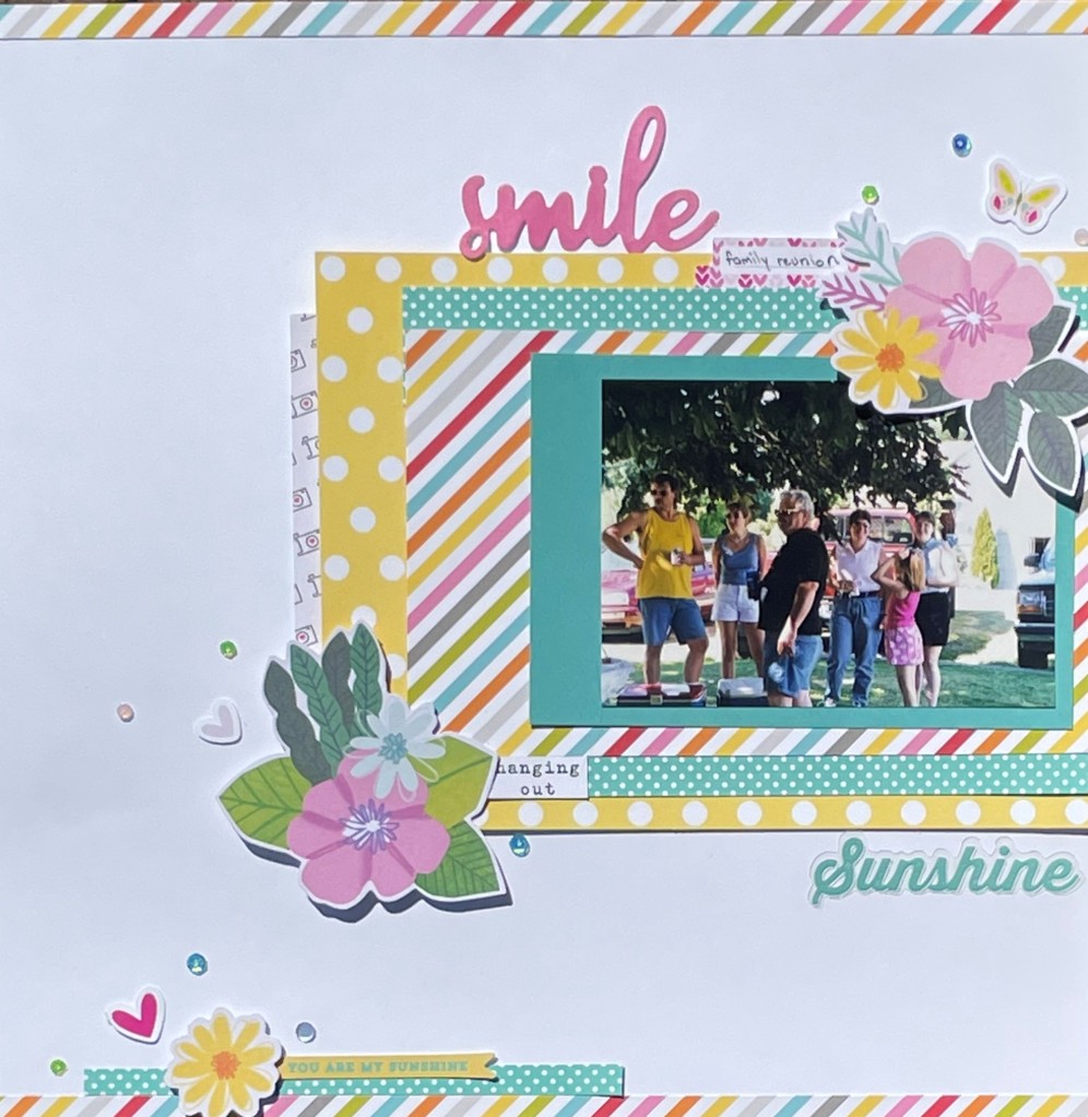
For this layout, the focus is an offset block of stacked paper. I do love me a good layered paper layout. Admittedly, I did do a bit of cheating. That turquoise polka dot paper? What you see is all I had of that. I cut it into thin strips, and placed it above and below the striped paper, making it look like a larger scrap. The little bit of camera paper peeking out the left hand side is really a 3×4 journal card. Careful placement just gives the appearance of a larger piece. Sometimes a little optical illusion can stretch your supplies.

When it came to embellishing, I immediately reached for my die cuts. I was looking for pink and yellow. There were some great flowers that fit the bill Shimelle’s Never Grow Up collection. I then added in some smaller bits from a variety of die cut packs. I was just looking for colors that matched. Recently I’ve fallen in love with Simple Stories’ Simple Pages Page Pieces. No, I don’t use them the way that I’m “supposed” to use them. I use them like any other pack of die cuts. The little hearts and butterfly came out of Page Pieces pack. My title pieces came out of 2 other embellishment packs. The final touch was a few colorful sequins sprinkled around. This is another new obsession of mine. Catherine Pooler’s sequin mixes are my new go to for finishing off my layouts.

In the end, this is one of my favorite recent layouts. Old family photos need a little love too. I think this is just the beginning of scrapbooking the past. Totally radical, right?

The Castle

Hey, remember how I said I was trying to use my Disney themed papers and embellishments?  Well, that flew out the window as soon as I went to scrap this photo.  Do you see those beautiful blue and purple tones?  They were screaming out for papers that could live up to their elegance.

I recently received the purple, blue, and teal geometric paper from the Bloom Street collection.  (I’m kicking myself for not ordering that collection.  It’s incredible.  And yes, I am aware that I keep posting that I am not a collection scrapbooker.  The paper… it calls to me!)  I thought the colors were a great match to the castle.  So I went through the remainder of my purple papers and pulled out that purple/pink background paper as well as the dark purple that I border punched.  I liked the contrast while staying within the same color family.

Lovely

For the design, I took inspiration from a layout by Mandy Melville that I found on Pinterest.  She has a blog that you can find here.  I really like how it shows off both the photo, and the paper.  The design is super simple, without looking plain.  I did find that I had to mat the photo in order to give it more weight and have it stand out from the paper.

The embellishing went rather quickly for once!  I chose to go with some new die cut florals.  Most are from Shimelle’s Never Grow Up collection.  They were rather large, which worked well for this layout.  I did do a bit of layering, so there are multiple floral or leaf pieces in each cluster.  Some are popped up with foam squares to give a bit more dimension.  I also added in some silver foam hearts and leaves to go with the silver title.

This is one of my favorite layouts in my Disney album.  Sometimes you just need an exquisite photo and a simple design.

Feels Like Summer

When the sun comes out, it just warms my heart and soul.  Living in a place where it rains 10 months out of the year can be brutal.  Waking up to a day of unexpected sunshine is glorious.  It makes my creativity bloom.  So, today I spent the day getting crafty with a summer page.  (Oh how I long for summer!)

This page did not go at all as I had planned.  I had envisioned a white background, photos matted with just a touch of yellow, and a background stamped with black splatters.  As you can see, that did not happen.  Once I got the yellow paper chosen and set it against the white cardstock, it just felt so stark.  Though I love the minimalist look other people use, it doesn’t feel right for me.

At that point I spied the teal star paper by Shimelle in my scrap bin and began to rethink my design.  What if I were to pull all of my embellishments that were yellow and teal, then work from there?  I went through every die cut, brad, and sticker I owned.  In the process, I found some pieces from October Afternoon that were pirate themed.  I about fell over when I realized they were the perfect colors for this layout that included a picture of a boat.  Yes!  That never happens!

Astoria

At that point I just began laying things out.  Placing items, shaking my head, and trying another combination was my strategy.  Honestly, it didn’t take a long time.  The nice thing about sticking to two colors is that your options are limited.

I will say that I broke some “scrapping rules” when I put this together.  There is a mixture of both bright white and cream on the page.  While placing things, I was careful to not place the cream and white together, so it isn’t as apparent.  The other color combination that I generally don’t put together on a page are black and navy.  I thought about using black for the title, but it would have been too jarring.  Instead, I went with navy.  Oddly, I like it even though there isn’t any other navy on the layout.

Even though I strayed far from my original plan, I love the finished page.  It reminds me that when I try too hard, the layout doesn’t turn out the way I want it to.  This time I just let instinct take over, and I am thrilled with the result.  Note to self:  When crafting, turn your brain off and go with the flow.

Missing

I know.  I have been MIA for months.  It has been a busy time.  The holidays always are.  My itty bitty family was also dealing with a sick pet that sadly crossed over the rainbow bridge.  So when you put together holiday stress, pet stress, and just everyday stress… you just don’t get much scrapbooking done.

It appears we are mostly beyond the chaos, and I feel like getting my crafting on again.  So much time has passed that I am at a bit of a loss on where to start with a new project.  My own creativity isn’t really flowing right now.  When in doubt, I turn to a sketch.  For me, it is a nice little map that doesn’t require much thought from me.  In this case,  I cased my Pinterest boards and found the perfect sketch here.  I love it because it allowed me to pull from my scrap bin.

The Marina

Once I had the sketch, I chose that incredible floral by Carta Bella.  I’m loving the peach and teal combination on a butter yellow.  From there I went through my 12×12 papers that are ancient.  Seriously.  I have a stack of papers on the floor (please don’t judge) of really old papers that I need to use.  This one fit the bill perfectly.  It was the right color, and the pattern reminds me of flower stems.  At that point I pulled scraps from my bin.  I was excited to find both the dark and light pink/peach color found in the floral.  The navy and brown scraps were added to match the photos.

I will be honest.  At first I placed the rectangles of paper in the exact order and position as the sketch.  Something wasn’t quite right.  I let it sit for a day and then did just a minor reorganization the next morning.  It’s amazing how much a tiny change can make a page come together.  Let the gluing begin!  I always feel better once the papers are down and I can no longer fiddle with them.

For embellishment, I went with some floral die cuts that matched fairly well.  The light pink wasn’t quite the right shade, but sometimes you just have to go with what you have.  A few puffy hearts from Shimelle, a smattering of enamel dots, and a stitched navy circle finished off my decorating.  I am just never going to be an elaborate embellisher.  I have tried.  It just isn’t me.

There you have it.  I am back in the saddle again.  Hopefully it won’t be another 3 months before I can glue some paper again.

Just a Cat and Some Scraps

I know this is quite a simple page, but I thought I would share it anyway.  This is the result of a scrap bin diving session.  My scraps are once again getting out of control.  Whenever that happens, I like to make a page or two out of scraps.  I wish I could tell you that the bin is no longer overflowing, but that would be a lie.  A really big lie.

This layout started with the floral scrap from Simple Stories.  Oh, how I love that paper.  It makes the perfect jumping off point because it has so many colors.  I dug through the rest of my scraps to find a harvest gold, a teal, and a brown.  Don’t you just love fall colors?  I added in a scrap of kraft cardstock before finding a dark red background.  I layered up the boxes of papers without even really having to trim anything.  That never happens!


Good Day

I knew my embellishing was going to start with those brown corrugated pieces.  They have been in my collection forever.  I love their texture, but rarely do they fit with my color scheme.  Here, they were a great match.  The hearts came next because I love that kitty!  Look at his sweet little face.  The copper hearts and title come from Shimelle’s Go Now Go collection.  I finished it all off with a few Simple Stories stickers.

Though this layout isn’t fancy, I still love it.  There is nothing extraordinary about it.  In fact, the Thickers are the only thing on this page that hasn’t been sitting in my stash for years.  I almost think that makes me love it all the more.  Old supplies don’t have to look or feel old.  They deserve to be dusted off and used to make beautiful things.

Back to 12×12 Papers

You may have noticed by now that I don’t scrapbook events in order.  In fact, it may take me a year or two to scrapbook our vacation photos, or Christmas, or anything else.  I pull photos out randomly, depending on my mood.  If I tried to scrap an entire vacation from beginning to end, it would feel like an assignment.  The last thing I want is for my hobby to feel like work.

So here is a warning that you may see beach layouts periodically for the next couple of years.  I think I have 20-30 photos waiting to be scrapped.  When I only scrap 1-2 photos on a page, it will take a while.  Hrm… now there’s a good potential future challenge.  Maybe I will see if I can create a page with 4-6 photos on it.  I may need to see if I can find Shimelle’s 4×6 photo love series.  She had some great ideas for multi-photo layouts.

The page I created doesn’t feel beachy at all.  Sure I worked in a tiny bit of blue and aqua.  However, my focal colors are red and creme.  Please don’t ask me why I went in this direction. I actually just thumbed through my random papers until I found two I liked.  You will also notice there isn’t a shell, wave, or otherwise watery theme in sight.  Though I admire themed pages, I just can’t seem to manage them myself.

Road Trip

There are a couple of things I really like about this layout.  First of all, I loved how easy it was to use up some scraps.  I just pulled together a bunch of random scraps that sort of worked together and cut them into banners.  Voila!  Fewer scraps in the bin.  The photo mats were also made from a scrap.  My other favorite part is the use of pocket page cards.  I managed to get 3 of them onto this page.  They tend to sit in my collection forever!  Using them feels like a major scrapbooking win.  (It’s the small things that make me happy.)

Though the overall page is clean and simple, it is a current favorite.  The photos are clearly the star.  (As they should be!)  A few wood veneer pieces to play up the nature theme and  some hearts was all it needed.  That’s it!  It feels good to be scrapping with 12×12 papers again.

Experiment Failure

Not everything  goes as planned.  Okay, rarely does anything go as planned… at least in my experience.  This is one of those pages that I envisioned for greatness.  Alas, it came out not quite as I had hoped.

In this case, I started with a Shimelle paper down at the bottom.  I adore all of those multi-colored circles.  They seemed a little sparse to me, so I had an idea.  Wouldn’t it be fabulous to add paper circles of my own?  Then I would pop some up on dots and it would be some magnificent work of art.  The idea was decent.  The execution was less than spectacular.

Be a Star

I admit that I am frustrated.  There were elements on this page that I forced, even though I knew they weren’t quite right.  Honestly, pretty much all of the embellishment seems off to me.  *Sigh*  I think the sad part is that this page had some good paper choices.  The bare bones of the page aren’t bad at all.  It’s what I did after the papers, pictures, and journaling were down that ruins it for me.

So let’s talk about what I do like.  I do love the papers and the color choices I made.  I wouldn’t change a thing about them.  I actually like this photo of myself.  (Hey, that doesn’t happen too often!) It’s a grainy phone selfie, but that expression is totally me.  I really like that for once I spent some time journaling.

Most of my pages are fairly free from journaling.  This page actually has quite a bit.  In fact, there’s more than you see.  At the top right corner of this page is an aqua tab.  That’s the top of a recipe card that contains some hidden journaling.  I was careful of where I put the glue so that it formed a pocket behind the green cardstock.  Just pull up on that little tab, and voila!  More writing!

I don’t know why I love hidden journaling so much.  Maybe because I’m a bit of a private person.  However, I think it is more than that.  It reminds me of a hidden door in a house.  I’ve always wanted to find one of those!  This is my own little hidden door.  I know where it is.  Now can anyone else find it?  (Not much of a challenge since I have told you where it is.  Look for more hidden journaling in the future!)

Cloudy With a Chance of Creativity

I finally had a bit of a creative breakthrough.  It isn’t waaaaaaaaaaaay off of my regular scrapping path, but I did include some fussy cutting.  For the record, I hate fussy cutting.  Yes, I know you move the paper, not the scissors.  Still, I get impatient after the first couple of cuts.  Then I get reckless.  Next thing you know, all of those smooth curves get hacked to pieces.

Two things finally got me going.  First, a beautiful cloud paper from Shimelle Laine’s Starshine collection just begged to be fussy cut.  I love the paper, but couldn’t figure out how to use it as a layer in a layout.  So out came the scissors.  I cut quite a few of the cloud groupings without knowing what I was going to do.

The second catalyst turned out to be exhaustion.  The day that I had cut out the clouds, I tried to place them on the layout.  Nothing looked right, and I finally gave up.  So, on a night that I could barely keep my eyes open, I began to work on it again.  The clouds just magically fell into place.  Lack of sleep seems to allow me to not overthink things and just create!  I often do my best scrapbooking in the wee hours of the night.

Real Life

It isn’t a fancy page with a lot of embellishment.  The clouds themselves seem to be enough decoration.  Some are popped up to give a bit of dimension.  I sprinkled them with my favorite wood veneer hearts.  Originally the photos were floating a bit, so I made a shelf for them with the wood grain scallop sticker.  The wood grain was chosen to work with the hearts.

The page still isn’t perfect.  I can see two things in the photo that bother me.  First, I’m not sure about the silver foam Thickers.  I am not going to change them out for something else.  They were the right size for this layout, and I can live with it.  I’m also considering adding a cloud at the top right of the vertical photo.  That white corner formed by the photo and the bottom of the cloud just doesn’t look right.  (Of course I didn’t see that until I photographed the page.)

Still, I am rather happy to have changed it up a little.  On to the next project!

Midnight Scrapbooking

I am the queen of insomnia.  Some nights I don’t get to sleep until 3:00 in the morning.  Sometimes I just wake up hours early.  Last night I had the fabulous experience of doing both.  One thing that sometimes helps me get my mind to stop spinning is to get up and work on a page.

Last night I managed to complete a page from start to finish.  Well, in all honesty, I already had the papers and photo picked out for this layout.  My goal is to use some of my die cut papers.  Remember when they were all the rage?  This one is from Bo Bunny’s Block Party collection.  2010 is in the house!  The other papers were in my scrap basket.  I cant identify them all.  If I had to guess, I would say there is some Pebbles, Fancy Pants, and DCWV mixed in there.

Paper placement was pretty easy on this one.  I started with the light blue chevron to mat the photo.  Then I flipped the off-cut over so the navy blue with the white stars was showing.  The brown, red, and green strips were pretty much just stuck down at different lengths to add interest.  I also rescued the quote from my scraps bin.  It was perfect for a page about my dad looking at vintage cars.

As far as embellishing went, I first grabbed for stars since the background paper features stars in the upper right and lower left corners.  It gave me a chance to pull out that American Crafts star garland.  At first I was only going to put one string of stars below the photo.  It just looked awkward.  So, I arranged a second messy line below the first.  That helped fill up the space and made my chaotic placement look more deliberate.  (It was!  I promise!)

Cork stars were also carefully placed in order to frame the photo.  Really, I was also trying to cover some of the square corners of the papers.  It’s a good trick to soften some of the “boxiness” that occurs with lots of rectangles on a page.

I also sprinkled in some stickers.  I may be a bit obsessed with Shimelle’s puffy hearts.  I’ve used them so often lately.  They have some nice masculine colors, something that can be difficult to find when searching for sticker hearts.  No, not all hearts need to be pink and girly.

For something that got thrown together in the wee hours of the night, I’m really happy with this layout.  Die cut papers with printed embellishments in the corners are not easy to use. The photo and papers were placed just perfectly to show off this oldie but goodie.  Now I think I need to do all of my scrapping in the middle of the night.

Blog Goals Broken

I knew this day would come.  I set out to publish 2 regularly scheduled blog posts a week.  That’s right.  No matter what, I was going to grace the internet with my words of scrappy wisdom twice weekly.  I was going to be the blogger you could count on to produce new content like clockwork!  At one point, I even had my posts written 2 weeks in advance.  This was going to be a piece of cake.

Somehow I had forgotten that creating projects, photographing them, and writing takes time.  Time I had during the summer.  Then work started back up for me.  Suddenly I was investing 50 hours a week away from home.  Some nights I got home at 6:00, and others at 9:00.  Even though I did try to scrap each night, it wasn’t much.  This last week I managed a card and a quick layout.  Since they were completed this evening, I haven’t had a chance to photograph them.

So instead of a new project, I am going to share with you what arrived on my doorstep this afternoon.  A few scrappy goodies showed up in time to get me working in the scraproom today.

collections

After telling myself that the last thing I need is more paper, I ordered 3 new collections.  The Simple Stories “Posh” is right up my color scheme alley.  I know I have enough pink and teal to scrap into 2018, but I just couldn’t help myself.  Honestly, I think the dog icon sent me over the edge to buy this one.  Bella Blvd. put out the “Oh My Stars” collection.  It appeals to my need for bright colors.  Did I mention I am addicted to stars as well?  This was a must have for me.  I also decided on MME’s seasonal “Sugar Plum.”  Yes, I know.  More pink and teal was probably not what I needed in my stash.  The papers are so beautiful!  I even like the dreaded glitter that gets everywhere.

embellishments

I purchased some matching embellishments along with odds and ends that I couldn’t resist.  I absolutely needed the matching die-cuts and chipboard elements for the collections I purchased.  Look!  There’s the cute little “Posh” dog!  I also had to have the chipboard leaves from Jen Hadfield.  I have not a single project in mind for them.  They just needed to be mine.  There’s a bit of Shimelle’s collection as well including the word Thickers, enamel shapes, and puffy hearts.  I love each and every piece.

I hope you will accept the photos of my new toys as an apology for a late post.  I also hope you forgive me if I begin posting once a week.  Of course, if anyone could clone me, I would be happy to send the clone to work while I play with paper and glue.